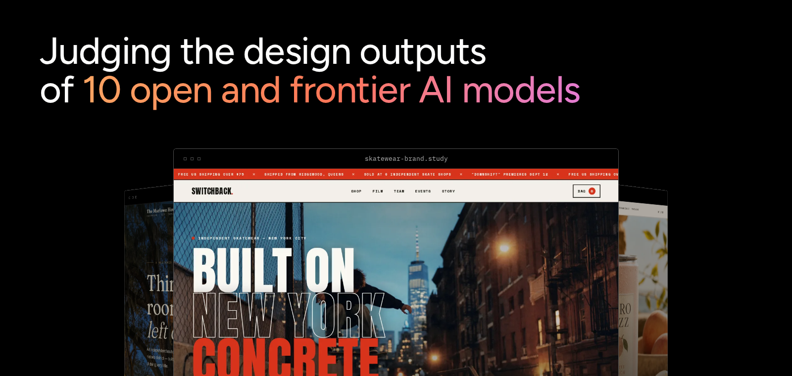
Earlier this week, we gave 10 models from 10 labs the same 10 design briefs and prohibited the models from using references, frameworks, or web search. We wanted to understand the design sensibilities of the models themselves, including where they differ and converge, how they defend their design decisions, and how their designs align with human preferences. We ended that post by saying people had also judged the designs. So here are those results: we put every design, every vote, and every stated rationale into an interactive dashboard.
We ran a blind, balanced round-robin in Label Studio. Every model faced every other model once for each brief. That gave us 450 head-to-head comparisons. We collected 10 votes per comparison, for 4,500 votes from 29 annotators.
Annotators saw two sites side by side. They did not see the model names. They were tasked to pick which version they aesthetically preferred, or mark the round as a tie. Then, we calculated a global preference ranking using a win rate.
To calculate the win rate for model i, take every vote it was involved in. Give it a full point each time someone picked it, half a point each time someone called a tie, nothing when it lost. Divide the points by the number of votes. We show this as a formula below.
The following table shows the ranking of all ten models in the test set, ordered by win rate.
| Model rankings | ||||
|---|---|---|---|---|
| Rank | Model | Win rate | Bradley-Terry strength | Range across briefs |
| --- | --- | --- | --- | --- |
| 1 | gpt-6-astra | 64.3% | 1.78 | 1st to 8th |
| 2 | grok-4.6 | 62.7% | 1.67 | 1st to 8th |
| 3 | muse-spark-1.3 | 60.3% | 1.52 | 1st to 7th |
| 4 | deepseek-v4-pro | 56.2% | 1.29 | 1st to 9th |
| 5 | kimi-k3 | 53.3% | 1.16 | 1st to 8th |
| 6 | glm-5.3 | 53.2% | 1.15 | 1st to 10th |
| 7 | claude-sonnet-5 | 49.1% | 0.98 | 4th to 9th |
| 8 | qwen3.8-2.4t | 48.9% | 0.98 | 1st to 10th |
| 9 | gemini-3.8-flash | 32.8% | 0.51 | 4th to 10th |
| 10 | seed-2.0-code | 19.1% | 0.26 | 7th to 10th |
Two checks make us more confident in this ordering.
First, we balanced the schedule. Every model faced the same opponents the same number of times. No model got an easier path through the study.
Second, we fit a Bradley-Terry model to the pairwise results. Bradley-Terry estimates for each model a single hidden strength, chosen so that the odds of one model beating another match their strength ratio across all 4,500 votes. We ran it because win rate ignores who a model faced: if our order were an artifact of scheduling, the two methods would disagree, and instead they return the identical 1-to-10 ranking. The Bradley-Terry scores return the same 1-to-10 order as our preference ranking, proving that our ranking isn’t the result of an unbalanced matchup or the scheduling, but rather is the result of true human preference.
Two pairs are too close to call. Kimi-k3 and glm-5.3 are separated by 0.1 percentage points. Claude-sonnet-5 and qwen3.8-2.4t are separated by 0.2.
We treat both pairs as ties.
Before you quote the overall ranking to claim which model did best, look at what happened on individual briefs.
Seven different models finished first on at least one of the 10 briefs.
gpt-6-astra won the overall study and won two briefs outright. It also finished 8th on the medical-research-conference brief.
glm-5.3 had the best average brief rank of any model outside the top three, at 4.5. It still finished 6th overall because one poor result can outweigh several strong ones. On the science-publication brief, it finished last with a 24% win rate.
claude-sonnet-5 shows the other side of the distribution. It never finished above 4th or below 9th on any brief. That made it the most consistent model in the study.
And… It still finished 7th. Consistency did not make it anyone's favorite.
This is why one number per model can be misleading. If you are choosing a model for a particular kind of design work, the overall ranking is less useful than the results for the briefs that look like your work.
The dashboard has four sections.
The designs
Pick a brief from the thumbnail strip and browse the ten sites the models built for it, ranked by how often people chose each one. Open any design to see its cost, generation time, the model's stated direction, and the human evaluation. From there you can open the live site.
The decisions
This is what the models decided before they wrote any code. For the same brief, compare the typefaces they named, the palettes by hue and saturation, and the reasoning they gave for those choices, in each model's own words.
Overall rankings
See the global ranking across all ten briefs, including each model's best and worst finish, and how it compares with the pilot run.
Shared patterns
See how far each model's choices sit from the rest, then where they converged. Inter appeared in 53 of 100 creative directions. IBM Plex Mono appeared in 34. Fraunces appeared in 25. The dashboard also shows the recurring color and layout choices.
The results are downloadable as JSON, and the rankings and pilot methodology as CSV.
If you want to check our arithmetic, the underlying numbers are there. In the weeks to come, we’ll be deep diving into some of the most interesting results from this human preference study, backed by real data from the Dashboard. Stay tuned.