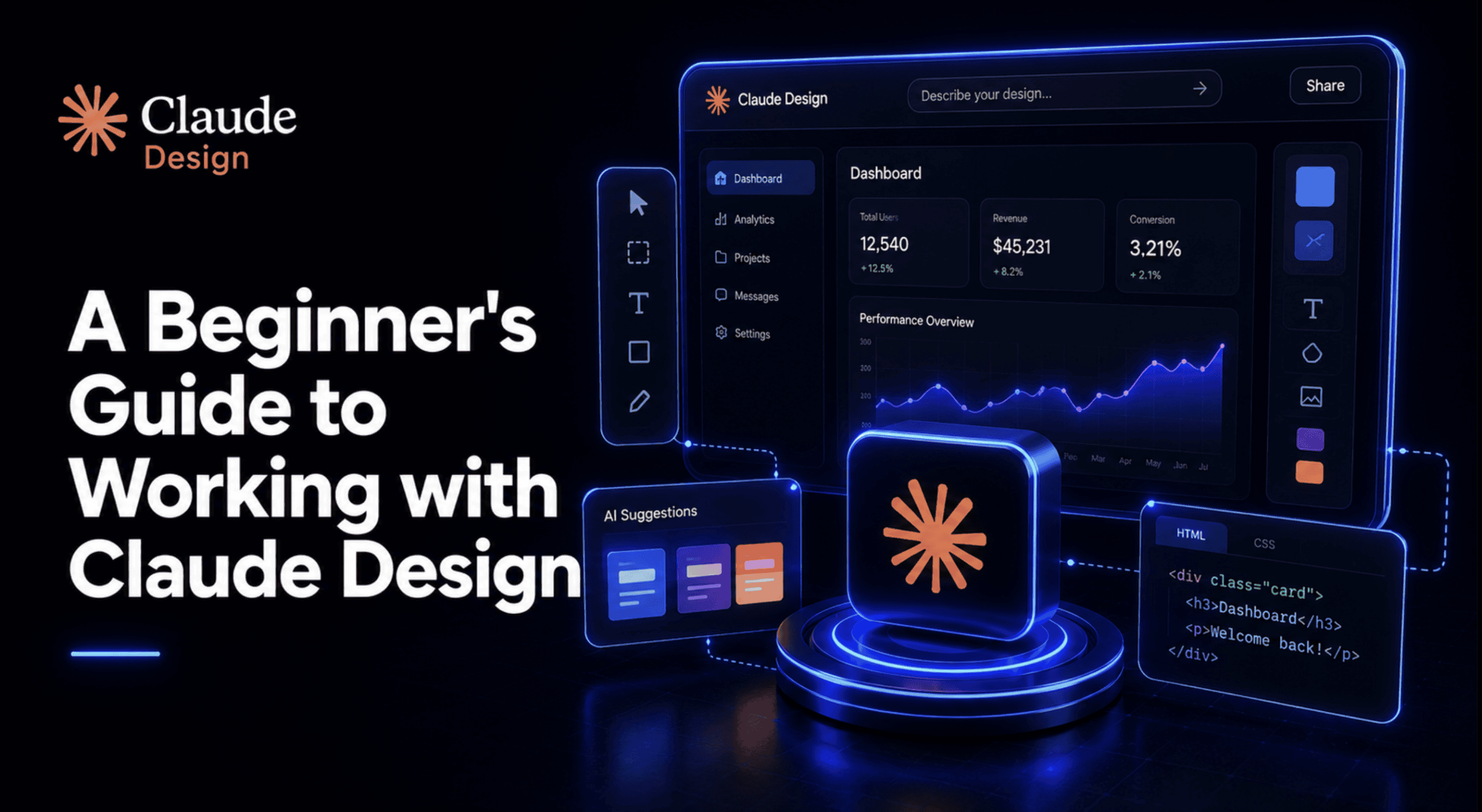
Claude Design is a research preview under Anthropic Labs, powered by Claude Opus' vision capability, generating interactive prototypes with working navigation, embedded video, voice input, and 3D elements.
# Introduction #
On April 17, 2026, Anthropic launched Claude Design. That same day, Figma's stock dropped roughly 7%, and Figma's own board member Mike Krieger stepped down just three days before the announcement — a coincidence in timing that market watchers noticed immediately. That's a real reaction from real investors, and it says something about how the industry is reading this launch. It says almost nothing about what a beginner should actually do with the tool on their first afternoon.
This guide is for that second question. Claude Design is new enough that most of what's written about it right now is either marketing copy or first-impressions hype, so this article focuses on the part that actually matters if you're about to open it for the first time: what it is under the hood, how to get a real project off the ground instead of a generic first draft, where it genuinely competes with tools you already know, and where its rough edges still show.
# What Claude Design Actually Is #
Claude Design is a research preview under ** Anthropic Labs**, Anthropic's category for early, still-evolving products. It's powered by Claude Opus 4.7's vision capability, and it's live now at
claude.ai/design. It's available to anyone on a Pro, Max, Team, or Enterprise plan, though Enterprise admins have to turn it on deliberately since it ships off by default at that tier.
Claude Design UI
The detail that actually matters for how you'll use it is what's happening underneath the canvas. Claude Design doesn't generate flat images the way an image model does. It generates real, working code, and that single distinction is what makes everything else about the tool possible: interactive prototypes with working navigation, embedded video, voice input, and 3D elements, because the output is genuinely code a browser can run, not a static picture of an interface. One detailed hands-on account described this directly as code being the universal medium underneath everything Claude Design produces, whether the output looks like a slide deck, a landing page, or a full interactive prototype.
That framing matters because it sets expectations correctly from the start. This isn't a faster ** Canva**, and it isn't a replacement for Figma's vector-precision design tools. It's closer to a design partner that happens to output code, which means its strengths and its current gaps both trace directly back to that one architectural choice.
# Getting Started: Your First Project #
Opening Claude Design for the first time presents four starting points: Prototype, for interactive interfaces and flows; Slide deck, for presentations; From Template, for a pre-built starting structure; and Other, an open lane for anything that doesn't fit the first three — single-page documents, infographics, or one-off visual assets.
Claude Design working layout
The working layout is a chat panel alongside a live canvas, which will feel immediately familiar if you've used Claude Code, and the resemblance isn't superficial. Type a first prompt describing what you want, and rather than immediately generating something, Claude Design commonly asks clarifying questions first — about audience, tone, or structure — before it starts building. That's the same underlying pattern as Plan Mode in Claude Code: propose before executing, rather than guessing and hoping the first draft lands.
Answering those clarifying questions properly is worth more time than it feels like it should take. A vague first prompt gets a generic, portfolio-template-looking result almost every time, and the single biggest reason for that isn't a weak prompt; it's a missing design system, which is the actual subject of the next section.
Claude Design System
# The Design System Is the Whole Game #
Skip this step, and everything you generate afterwards will look competent but interchangeable with what any other Claude Design user gets from a similarly vague prompt. Set it up properly once, and every project afterwards inherits your actual brand, not a generic aesthetic default. This is, by a wide margin, the most consequential decision a beginner makes, and it's also the step most people skip because it isn't obviously required to get a first result.
- First, gather your actual brand inputs — colors, fonts, logo files, existing screenshots, and anything that represents what your output should genuinely look like.
- Second, upload them and let Claude generate a starting UI kit from what it's given.
Setting up your design system
- Third, review that draft critically rather than accepting it, since the model's first pass at interpreting your assets won't always match your intent.
Reviewing your draft design system
- Fourth, validate it with a handful of test prompts covering different content types — a form, a data table, and a hero section — to confirm the system holds up outside the exact example it was built from.
Validating your design system
- Fifth, publish it, and treat it as a living document you keep refining rather than a one-time setup task you never revisit.
There's a genuinely useful two-step workflow worth adopting here if your brand assets are scattered across a dozen files and old decks rather than living in one clean source: use Claude Cowork first to synthesize everything into a single, organized brand document, then feed that document into Claude Design's system setup. Doing the messy consolidation work in Cowork before Claude Design ever sees your assets means the design system it builds starts from something coherent instead of forty conflicting screenshots.
Once a design system is published, it applies at the organization level for Team and Enterprise accounts, which means the second project anyone on your team starts inherits the same components, colors, and type scale automatically, rather than every new project starting from zero again.
# Prompting It Well #
The gap between a beginner's first result and a genuinely usable one is almost always the difference between a one-line prompt and a properly structured brief. The pattern worth adopting covers four things every time: the goal (what this piece of output needs to accomplish), the audience (who's actually going to see it), the key information (the specific content that has to be present, not implied), and the layout structure (roughly how it should be organized, not just what it should contain).
Once a design system is in place, referencing its components by name inside a prompt — "use the primary button style from the design system" rather than "make the button blue" — produces noticeably more consistent results, since Claude Design is drawing on an actual, defined component rather than reinterpreting your intent from scratch each time.
For revisions, there's a meaningful difference between the inline comment tool and the chat panel. Inline comments work well for specific, localized feedback tied to one element — "this heading is too small" — anchored directly to the thing you're pointing at. The chat panel is the better tool for structural or scope-level changes — "reorganize this into three sections instead of two" — where the change touches the whole layout rather than one component. One habit worth building early: save a version before attempting a significant change. Claude Design supports version history, but if you're mid-experiment and want to compare two different directions rather than only being able to roll back to the last save point, deliberately saving before a big swing gives you a clean comparison point rather than a fuzzy memory of what the previous version looked like.
# Situating Claude Design next to Figma, Canva, and Vibecoding Tools #
Claude Design doesn't cleanly replace any single existing category; it overlaps with three of them simultaneously, which is part of why it's genuinely useful and also part of why it's easy to misuse if you expect it to behave like the tool you're used to.
Tool | Best for | Collaboration depth | Output type |
Export path |
|---|---|---|---|---|
Claude Design | Fast first drafts, interactive prototypes, decks, and iterating through natural conversation | Chat-driven, single canvas, org-level design systems on Team/Enterprise | Real code (HTML/CSS/JS under the hood) | Code bundle; PPTX for decks (with some layout simplification) | Figma | Pixel-precise vector design, complex multi-page design systems, and deep team collaboration | Native multiplayer editing, comments, version branching, and dev handoff tooling | Vector design files | Figma files, dev-mode specs, plugin exports | Canva | Fast, template-driven marketing assets and social content | Shared workspace, brand kits, simple commenting | Flattened graphics, some interactive elements | PNG, PDF, video, direct social publishing | Vibecoding tools (v0, Lovable, Bolt) | Going straight from a prompt to a deployable app | Mostly solo, code-review-based collaboration | Fully deployable application code | Git repo, direct hosting deploy |
The practical read on this table: reach for Claude Design when you want to move from an idea to something interactive fast, especially if the output is meant to hand off toward code eventually. Reach for ** Figma** when the project needs pixel-level design precision or a large team collaborating deeply on one complex system. Reach for Canva when the deliverable is a flat, templated marketing asset and speed matters more than customization. Reach for a vibecoding tool when the actual goal is a deployed application, not a design artifact that still needs a build step afterwards.
# Things Worth Trying as a Beginner #
A handful of starting exercises tend to teach the tool faster than reading documentation does. Try converting an existing document — a one-page brief, or a set of notes — into a polished one-pager, and pay attention to how much of the formatting decision-making Claude Design handles on its own versus what you have to specify. Try up a rough screenshot of an interface you like and asking it to turn that into an interactive prototype, which is a fast way to see the code-underneath-the-canvas architecture in action, since the result isn't a static copy — it's something you can actually click through.
Ask for an accessibility pass on something you've already built — contrast ratios, alt text, keyboard navigation — since catching these early is far cheaper than retrofitting them later, and it's a good test of how much Claude Design understands about a project beyond its surface appearance. Also worth doing at least once: ask for a full multi-step user flow instead of a single screen — a signup sequence, a checkout process — rather than one static page, since that's where the tool's ability to reason about state and sequence across screens becomes visible in a way a single-screen prompt never shows you.
Once you have a design system published, deliberately test its limits: throw an unusual content type at it — a data-heavy dashboard, a long-form article layout, something you didn't include in your original validation prompts — and see whether the system holds up or starts improvising outside your established patterns. That's the fastest way to find the gaps in your design system before a real project exposes them for you.
# Limitations, Governance, and the Handoff to Claude Code #
No new product launch is without rough edges, and Claude Design's are worth knowing before you build a workflow around it, rather than discovering them mid-project.
- On the capability side, it can't yet export finished output as video, even though it can generate video content within an interactive prototype — a specific and slightly confusing gap worth remembering. Inline comments have been reported to occasionally vanish in longer sessions. Large, complex projects can start to lag noticeably as the canvas grows. PPTX export for slide decks works but simplifies some layouts in the process, so a deck built for maximum visual polish inside Claude Design isn't guaranteed to look identical once exported. And there's a real diminishing-returns pattern worth planning around: refinement requests tend to produce their biggest improvements in the first handful of rounds, and pushing well past that point on the same piece of output tends to yield smaller and smaller gains for the same amount of prompting effort. - On the account side, usage limits have been reported as confusing to track in practice, and data residency support — meaning the ability to guarantee where your data is processed and stored geographically — isn't available yet, which matters if your organization has specific compliance requirements around that. - There's also a real asymmetry worth understanding in how Claude Design connects to Claude Code. Handing a finished Claude Design project off to Claude Code to turn into a production application works well; that direction is strong. The reverse — taking existing code and pulling it back into Claude Design for further visual iteration — is noticeably weaker right now. Plan your workflow with that asymmetry in mind: use Claude Design early in a project, before code exists, rather than expecting to bounce a project back and forth between the two freely. - If you are rolling this out to a team rather than using it solo, a phased approach is worth adopting over flipping it on for everyone at once: start with a small pilot group, get a real design system published and validated before it's the default expectation, and only open it more broadly once that foundation is solid.
# Wrapping Up #
The single lever that determines whether Claude Design feels genuinely useful or just like a novelty is whether you treat the design system setup as the real first project rather than a formality standing between you and the fun part. Do that properly in your first week, learn the four-part prompting pattern, and understand where the tool's current edges are, and Claude Design earns a real place in your workflow: fast, interactive first drafts that hand off cleanly toward Claude Code. Skip the setup and expect it to read your mind from a one-line prompt, and you'll get exactly the generic, competent-but-forgettable output that gives new AI design tools their worst reputation — not because the tool can't do better, but because it was never actually given the chance to.
is a software engineer and technical writer passionate about leveraging cutting-edge technologies to craft compelling narratives, with a keen eye for detail and a knack for simplifying complex concepts. You can also find Shittu on