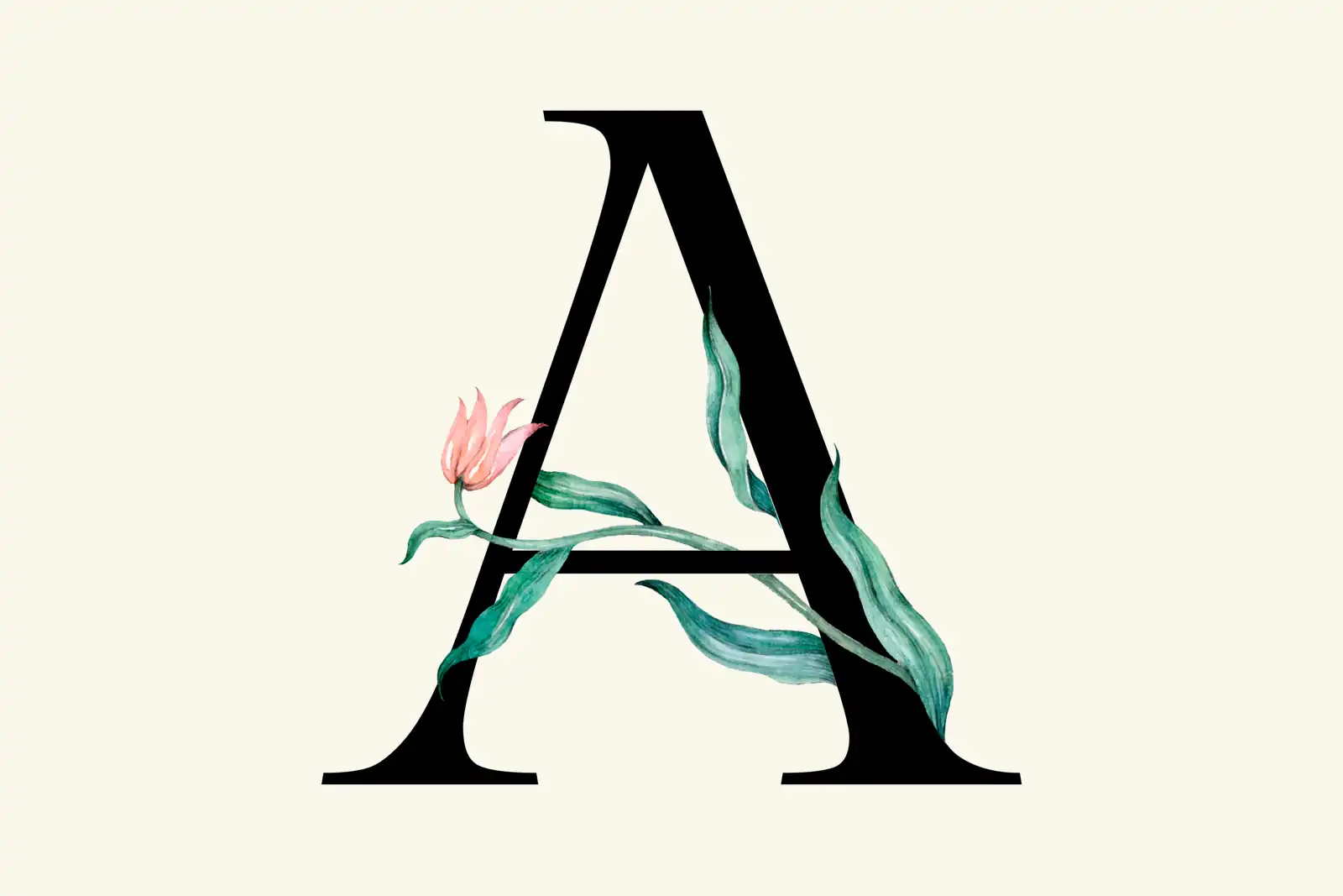
Here is a prediction we are willing to be graded on: over the next few years, typography-led websites in the tradition of beautiful editorial design will become the recognized look of premium, and image-heavy websites will increasingly read as cheap. Not because images got worse, but because they got free, and free things cannot carry a status signal.
Why Images Meant Premium in the First Place #
For most of the web's history, rich imagery was a proxy for investment. A lush hero photograph meant a photo shoot, a director, a location, a budget. Custom illustration meant a commissioned artist. Even good stock curation took a practiced eye and licensing money. Visitors never consciously ran that calculation, but the inference was real: a site drenched in high-production imagery belonged to a company that had spent something, and spending is what premium means. Economists call this a costly signal. The signal worked because faking it was expensive.
The Signal Just Inverted #
Then image generation collapsed to a prompt and a click, and two things happened at once.
First, the cost floor vanished. When any landing page can have an epic hero image for nothing, the epic hero image tells you nothing. A signal everyone can afford is not a signal.
Second, and more corrosive, authenticity became unverifiable. Every polished image now arrives with an implicit question mark: is this their actual product, their actual team, or forty seconds of prompting? The flood of synthetic imagery has a name now, and the public's patience for it is measurably gone: sentiment tracking put negative feeling toward AI slop at 54 percent by late 2025, with 39 percent of consumers reporting they abandoned a purchase over a bad AI-content experience and 63 percent saying they would pay more for a brand they trust to be authentic. The glossy synthetic sheen has become a brand risk with a dollar value.
Put those together and the old inference runs in reverse. A page stacked with generic-gorgeous imagery no longer whispers "budget." It whispers "generated." Image-heavy is becoming what stock photography became a decade earlier, and for the same reason: the handshake photo did not die because handshakes went out of style. It died because everyone could have it, so it meant nothing. AI did not start that process. It finished it, for the entire category.
Why Typography Inherits the Crown #
If imagery can no longer carry the premium signal, something else has to, and typography is the natural heir because it is the thing that still cannot be faked in one step. A real type system is hundreds of small decisions that have to agree with each other: scale, hierarchy, measure, rhythm, spacing, restraint, and the discipline to apply them identically across every page. That coherence is legible even to visitors who could not name a single font. It reads as taste, and taste is the one production input whose price did not collapse. The design-trend literature is already circling this. Type-first direction gets described as making sites "feel more premium while still supporting performance", the strongest current mood is called a reaction against AI-generated sameness, and forecasters are documenting a swing toward expressive, kinetic, editorial type and visibly human-made texture. What the trend pieces have not quite said out loud is the economics underneath: these are not parallel fashions. They are the same event. The premium signal is migrating from the asset that became free to the craft that stayed expensive.
Typography also happens to pay its own way. Type-led pages are light, fast, accessible, and translate cleanly, and in an era when LLMs read your site as often as humans do, a page whose meaning lives in structured text serves both audiences. The premium look and the performant look used to be in tension. They are now the same look.
The Nuance: Interchangeable Is the Enemy, Not Imagery #
The claim is not that images make a site cheap. It is that interchangeable images do. There remains a large difference between imagery as art direction and imagery as filler, and visitors can feel it instantly.
We would know: our own blog is illustrated. Every post carries an image from a single watercolor set, one consistent style and palette, applied everywhere. The point of those images is not "this page has a picture." The point is that they are recognizably ours, a visual system someone chose and committed to. An owned visual language is typography's ally, and it follows the same economics: the value is not in any individual image, which is cheap, but in the coherence of the whole set, which is not. What reads as cheap is the other thing: the asset acquired because a layout had a hole in it, gorgeous and anonymous and radiating no decision at all.
One more tell from the same shift, small but delicious: published checklists of AI giveaways now flag overuse of em dashes in copy. Every surface of a site, from copy to type, is being reread as evidence of whether a human cared. Design has always been evidence of care. What changed is which surfaces still count as evidence.
What We Are Doing About It #
This thesis is already our practice, and it predates the prediction. Our site leads with type: a display face with a point of view, a body face chosen for maximum legibility, an editorial hierarchy doing the visual heavy lifting, and an owned illustration system where imagery earns its place. For client work, the kit we reach for is the same: a type system with real conviction, layouts from the editorial tradition, restraint as a default, and imagery only where it carries meaning we can stand behind.
If you are auditing your own site against this shift, the questions are simple. Could this hero image appear on a competitor's site without anyone noticing? If the images vanished, would the design still have a personality? Premium was never actually the pictures. It was the evidence of care, and the pictures were just the cheapest place to show it. That era is over; the care has to live somewhere it cannot be prompted.