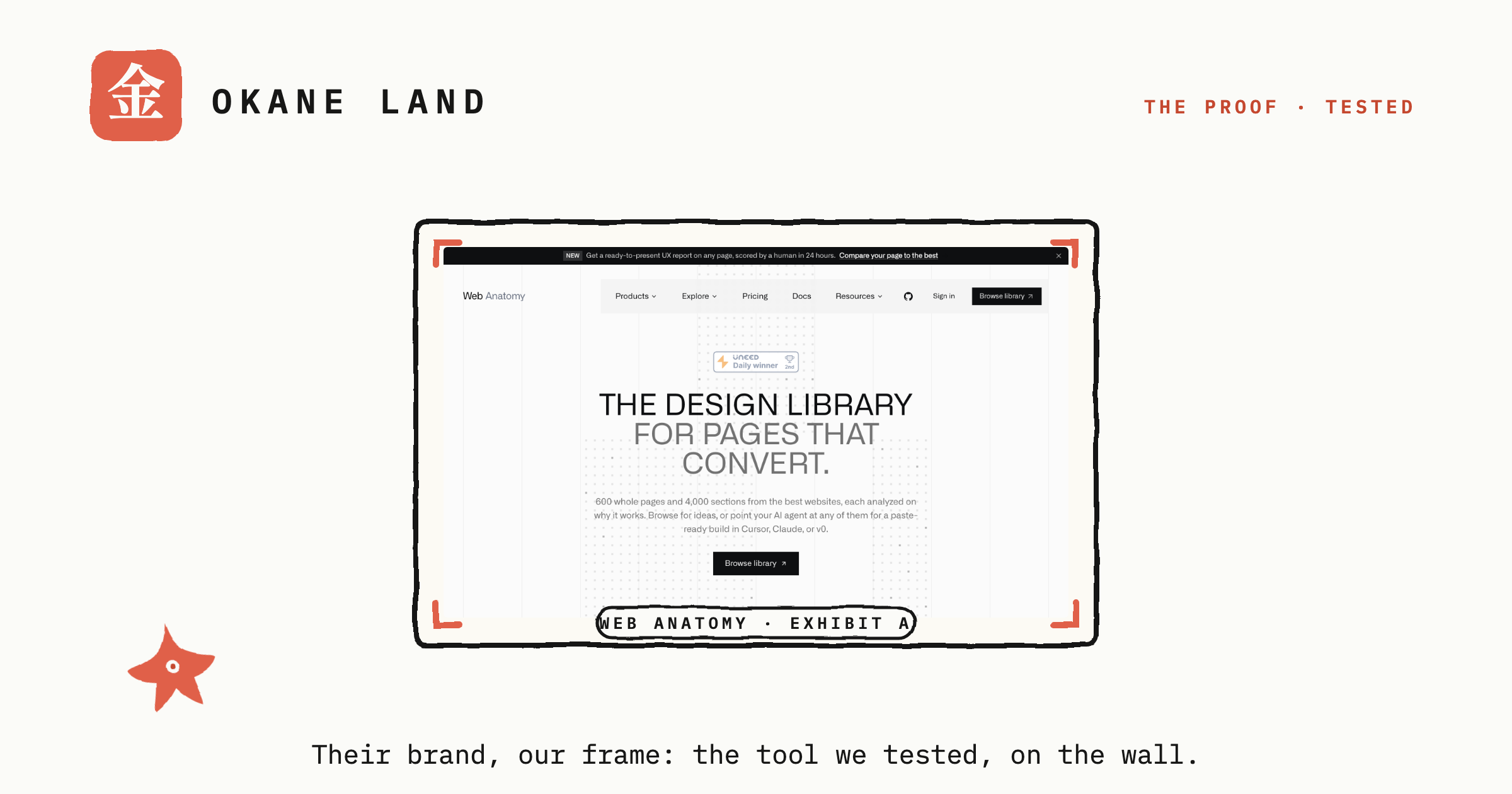
The Proof · AI tool
- Who it's for
- Vibe coders and solo founders who want proven page patterns to point an agent at, and who will use the section-level annotations rather than the leaderboards. Free is the tier that matters; the €9 month is worth it if a scored report on your own page is.
- Real cost
- Browsing the public galleries is genuinely free with no account. The skills pack is free, MIT-licensed and needs no token. The free analysis credit requires an account (email plus a 12-character password, or Google), and the report it returns is partially redacted. Pro is €9/mo and is the only way to get the MCP server. A human-written competitive report is €149 one-time. We spent nothing; the analyzer run used an existing free account.
A design library of scored, annotated landing-page sections from real companies, plus a free MIT-licensed skill pack for your coding agent. We ran its own audit rubric three times on the same page to test its reproducibility claim, ran the hosted analyzer on our own homepage and timed it, and checked its published analyses against the live sites they describe. The section-level work is better than almost any free CRO content. The scores and leaderboards deserve a more careful read.
What's good
- The section-level annotations are excellent and specific: 33 of 35 we sampled named exact copy, an exact number, or a named UI element. One cited a deploy log reading "blog live 4m 12s" as the proof of a five-minute claim.
- They are genuinely observational. Web Anatomy recorded Pumble at 361,477 teams; the live page now reads 363,883, a counter that increments. Somebody read the real number off the real page.
- The scoring rubric separates judgment from arithmetic on purpose, and it mostly holds: three independent runs of its 49-item audit agreed on 46 items, scoring 56, 56 and 59.
- The skills pack is free, MIT-licensed, needs no account or token, and publishes its full rubric with pass rules and an evidence-source discipline. Eight skills, with references and evals.
- The methodology page volunteers its own subjectivity, states there is no paid placement, and the MCP paywall is worded plainly with no dark pattern. All 146 screenshots we requested loaded clean.
- The live analyzer nearly beat its own clock, 2m 08s against a 2-minute claim, correctly inferred our persona and goal, and now discloses its SaaS-first scope in a banner. Its one-line verdict on our page was fair.
Where it breaks
- One load-bearing claim has no data behind it: heroes with social proof "convert better… in our dataset". No conversion data exists anywhere on the site.
- The page-level bullets are a weaker artefact wearing the same label. 9 of 30 were consultant filler about the company rather than the page, and the tell is exact: they quote no page copy.
- "Free, no signup" on the analyzer CTA is wrong. The credit requires an account, and the free report blurs the recommendations in six of eight categories, plus five of eight improvement ideas, behind PREMIUM locks.
- Quality control lags the positioning: a flagship page reads "1 hero sections in our library are flagged best-in-class", a fintech FAQ names five top performers of whom four are absent from its own leaderboard, and a customer-analytics company is filed under cybersecurity.
How we tested #
Point your AI agent at a page pattern that a real company shipped, rather than at whatever the model averaged out of its training data. That is the pitch, and it is a good one. The site puts it plainly: “Most AI pages are averaged from training data.”
It ships in two halves. The skills are free, MIT-licensed, install with one command and need no account or token, into the same agents we test elsewhere: Claude Code and Cursor. The MCP server, which is the live link to the library, comes with the €9/mo Pro plan. The docs are clear that “The skills work on their own. The MCP adds the live data.”
We did not run the vendor’s installer. Skills are markdown instruction files, so we cloned the repository read-only and read all eight of them instead. That is also how we tested the audit rubric: by following it ourselves, exactly as written, which is what an agent does with it.
Everything below was done on 8 and 9 August 2026, spending nothing and entering no payment details. One connection to disclose: Web Anatomy’s founder sat for our Studio interview in July, and this test was run three weeks later on the public product, without his involvement. Browsing and counting used no account at all; the analyzer run used a free account that already existed on this machine, and we created no new one.
Three independent runs judged the same page, okaneland.com, against all 49 rubric items, with no knowledge of each other’s verdicts. Separately we sampled 48 analysed entries across 8 industries and 15 section types in the library, requested all 146 screenshots from seven galleries, and checked a set of the site’s published analyses against the live pages they describe. We read an existing analyzer report end to end, then submitted a fresh analysis ourselves and timed it.
Two things we nearly reported and did not, because checking killed them. The score gauge that reads 0 on load is a count-up animation that settles correctly. Sentry traffic we assumed was errors is telemetry, and the console is clean.
The annotations are the real product #
The section-level work is better than the overwhelming majority of free CRO writing, and it is better because it is falsifiable.
The best example in our sample, on a hero scored 91:
Bolded time claim (in under five minutes) is proven by a deploy log ending at blog live 4m 12s
That names the claim, names the artefact on the page that discharges it, and quotes the number inside the artefact. Anyone can check it, and it teaches a move you can carry to your own page. Compare the usual standard of free CRO advice, which is “add social proof.”
They are also demonstrably observational rather than generated from a company description. Web Anatomy’s Pumble entry records 361,477 teams. The live page today reads 363,883. That is an incrementing counter, which means a real reader took a real number off a real page down to the last digit. On Passbolt it names the vault contents, the compliance row in order, and the fact that “Open source” is literally the first two words of the headline. We checked those against the live site and they are exact.
The reproducibility test #
The rubric makes an unusual claim for an LLM-driven product, and states it in its own documentation: “You do the judging. A script does the arithmetic.” The point is that the same judgments always produce the same number, so the score cannot drift on the maths.
That is true as far as it goes, and it dodges the harder question, which is whether the judgments themselves are stable. So we ran it three times, blind.
46 of 49 items were unanimous, an agreement rate of 93.9%. Final scores landed at 56, 56 and 59. For a rubric applied by a language model to a subjective question, a three-point spread is a genuinely good result, and better than we expected going in.
The three items that disagreed are the diagnosis. They were the five-second test, whether the hero is outcome-focused, and whether the primary call to action repeats often enough. All three are judgment calls, and at least one has a specific, fixable cause that the runs identified independently: the rubric never states a viewport for “above the fold”, so the same page passes at 1080px and fails at 720px. Define the viewport and one of the three disagreements disappears.
The runs surfaced other spec problems worth the vendor’s attention. The house style file forbids HIGH/MEDIUM/LOW severity labels in an audit while a sibling skill uses them. The rubric scores navigation and footer, but the canonical section taxonomy has no tag for either, so those findings cannot be filed. Output paths disagree between two files describing the same directory. And one rule instructs the agent to mark visual items as not-applicable without a render, while four of those items are pure DOM checks that need no render at all.
One more, which matters because it undercuts the pitch: a later step tells the agent to “trust the recommendation” over the computed result, sitting a few paragraphs below the step that sells the score as reproducible.
The rough edges around the scores #
The scored library needs reading with one eye open, because the editorial layer around it is not at the level of the annotations.
A flagship gallery page ships the sentence “1 hero sections in our library are flagged best-in-class” and then quotes four percentages about that population. The fintech page’s FAQ names five strongest performers, four of whom are absent from the leaderboard directly above it. A customer-analytics company is filed sixth in “6 best cybersecurity homepages” under the invented descriptor “Predictive security”, and one Gusto card prints 400,000+ and 300,000+ for the same statistic inches apart, when the live page says 500,000+.
None of that touches the thing the product does well. All of it is what a reader hits when they try to cite the aggregate layer instead of the annotations.
The claim we would ask them to withdraw #
This is the one that matters, because it is load-bearing rather than cosmetic.
On the hero gallery, explaining why the scoring weights what it weights:
in our dataset, heroes with those two convert better than heroes without them
No conversion data exists anywhere on the site. There is no click-through rate, no A/B test, no outcome linked to any score. What the library actually contains is pattern frequency among pages that a practitioner hand-picked as good, which makes “converts” a description of resemblance rather than of measured performance.
That is a perfectly respectable product. Plenty of useful design references are exactly that. But the sentence above claims a causal finding from data the site does not have, and it is the stated justification for the weighting that produces every number on the site. A nearby line has the same problem: “‘No credit card required’ outperforms countdown timers in 90% of top scorers” never says outperforms at what.
The methodology page elsewhere is admirably candid, stating that “Conversion analysis is subjective”. That is the register the whole site should be in.
We ran the analyzer #
Two runs inform this section: a report on this site’s homepage generated 28 July, and a fresh run we submitted ourselves on 9 August on the account’s free monthly allowance. The sidebar counter ticked from 3 to 2, which is itself a finding. The pricing page advertises “1 credit”, the app runs on a three-preview monthly counter, and nothing public explains the difference.
The flow nearly holds its headline promise. We submitted at 12:07:43 UTC and the executive summary rendered at 12:09:51, which puts “get your conversion audit in 2 minutes” eight seconds over its claim on our run. The report opens with a scope banner that was not there in July and deserves credit: “our analysis is primarily designed for SaaS landing pages. Results are still useful, but some recommendations may be less applicable to your site type.” Its one-line verdict on our homepage is fair and specific: “Beautifully curated and credible, but the first screen doesn’t quickly tell a new visitor what they’ll get, how often, and why subscribing beats just browsing.”
The free boundary, now observed rather than inferred from shipped code: on the preview tier, two of eight scoring categories show their recommendations and six are blurred behind PREMIUM locks, and the section-by-section improvement list shows two readable items followed by five rows reading “Locked recommendation #4” through “#8”. That is a legitimate way to run a free tier, and the pricing page should describe it, because “1 credit to analyze your landing page” reads like one full report.
Run against run, the analyzer is steadier at the top than underneath. July scored the page 64; August scored it 66, and the fresh report’s verdict quote is the sharper of the two. Under that two-point move, the classification flipped from Homepage in the AI industry to Landing Page in Other, and the category scores swung hard: Value Proposition 56 to 71, Trust 23 to 38, Conversion 74 to 53. Some of that is real, because we shipped new sections onto this homepage between the runs. Some of it is the cohort flip, which is the analyzer’s own doing. Cite the headline number if you like; do not build a to-do list on one run’s category scores.
The fresh run also re-scopes two defects we found in the July report, one in the vendor’s favour. The July report’s page-overview screenshot renders blank; the fresh report’s renders perfectly, our homepage with numbered section markers on the sections it read. So the defect is screenshot assets going stale within a couple of weeks, not a broken feature. The other two stand as of 9 August: the July report’s upsell card still says “Your page 62/100” against its own gauge’s 64, and still advertises, in full:
+0 more opportunities
A conversion-optimization product advertising zero additional value at the exact moment it asks for money remains a ten-minute fix.
One small credit from the plumbing: report URLs are login-gated, and the share link we minted to capture these screenshots is a long random token generated on demand. That is how it should be done.
What we could not test #
The signup flow is untested; our analyzer run used an account that already existed. The dashboard library pages behind the login, the fuller per-criterion view the site advertises, are also untested, so our conclusion that you cannot tell why a given page scored what it did applies to the logged-out library.
We did not pay, so the €9 MCP server and the €149 human report are both untested. Since the MCP is the entire paid proposition, treat this review as covering the free surface and the skills, and nothing else. Selling live data to agents is also exactly the market where our Study of agent economies found almost nobody clearing money, which makes the €9 MCP one of the more credible entries in that market rather than a red flag.
We also cannot verify the claim that every analysis is reviewed by a human before publication. The duplicated Gusto write-up, which appears in two different versions for the same score on two pages, and the Faraday misfiling, are evidence against uniform review rather than proof of its absence.
Recommendations #
Ordered by what we would fix first.
1. Fix “+0 more opportunities”, the 62-versus-64 mismatch, and the expiring report screenshots. The first two sit inside the paid conversion moment on a product about conversion. None is more than an afternoon.
2. Withdraw or substantiate the “convert better” sentence. Either publish the outcome data, or rewrite it to say what is true: these patterns are frequent among pages we judged strong. The methodology page already sets that tone. This is the single biggest credibility risk in the product, because the whole scoring apparatus rests on it.
3. Give “above the fold” a viewport in the rubric. One line in scoring.md removes a measurable share of the score variance we found. While in there, resolve the HIGH/MEDIUM/LOW contradiction, add taxonomy tags for nav and footer, and reconcile the two output paths.
4. Delete or ship benchmark-compare and improve-page. The moodboard skill gives routing rules for two skills that do not exist in the pack. An agent that follows those instructions routes to nothing.
5. Update the stale onboarding line. The write-page skill still tells users to “request beta access”. The docs and the dashboard both say a subscription unlocks the token automatically with no review queue.
6. Put the scores on the gallery cards. The galleries are the advertised front door and the least informative surface on the site: screenshots and a company name, with no score, no analysis, and no visible affordance that the card opens anything. The best thing the product makes is one undiscoverable click deep. This is probably the highest-leverage change on the list.
7. Split the two bullet families, or fix the weaker one. The page-level “what makes this page stand out” bullets fail in a diagnosable way: 9 of 30 quote no page copy at all and read as company summaries. A generation rule requiring at least one direct quotation from the page would catch nearly all of them.
8. Add a “last verified” date to every analysis. A third of the quoted figures we spot-checked had drifted, which is expected on a three-month re-analysis cycle and invisible to a reader deciding whether to cite one.
9. Say what “scored” means, once, near every score. Not measured conversion; conformance to a published rubric. The rubric is already public and that is a strength worth leaning on.
The verdict #
Situational, and the free tier is the one worth your time.
Use the section modals and the numbered annotations. That work is specific, checkable, frequently excellent, and free, and there is not much else like it. The skills pack is worth reading whether or not you ever pay, because the rubric is published in full and you can lift it. Treat the leaderboards, the aggregate percentages, the industry rankings and the page-level bullets as unreviewed. Verify any number you plan to cite against the live page. And read “converts” as “resembles pages a practitioner picked as good”, because that is what the data supports.
The gap here is not between a good product and a bad one. It is between a genuinely good core and an editorial layer that runs ahead of it. That gap is closable, and most of the items on our list are afternoons rather than quarters.
One email, when there's something worth sending
Get the research in your inbox. #
No fixed schedule, no filler. You get an email when we've tested something, run the numbers, or found a tool worth your time.
Free. Double opt-in, unsubscribe in one click.
Pointing an agent at a pattern library? Compare notes in the forum ↗
Sources #
Every outside quote in this review was re-fetched from its source before we used it.
| Source | Link |
|---|---|
| Web Anatomy, homepage, pricing and public galleries (read 2026-08-08) |
|