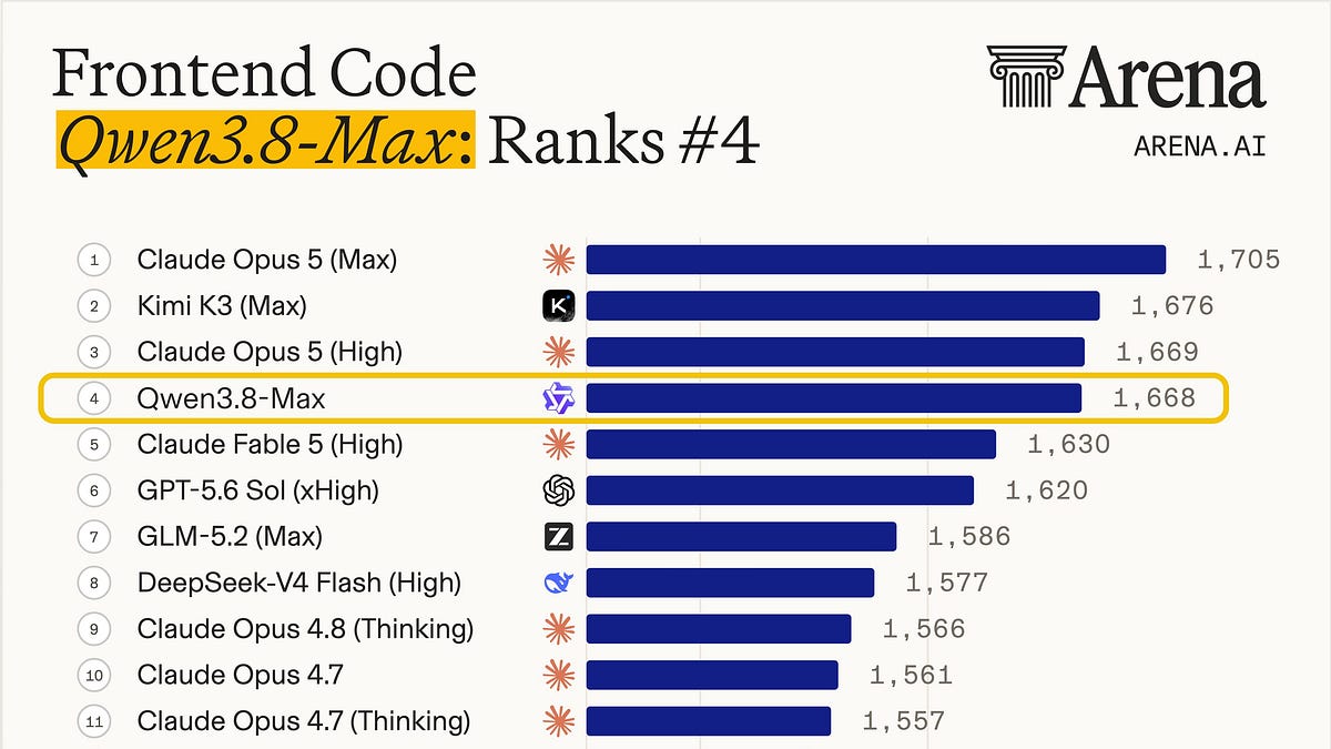
Alibaba released Qwen3.8-Max on August 2, and it debuted at #4 on Arena.ai’s Frontend Code leaderboard, one spot above Claude Fable 5. It is the second model from a Chinese lab to pass Fable 5 on that board in three weeks, after Kimi K3 took the #1 spot in July. We gave both models the same ten UI design prompts and compared the outputs, the costs, and how each agent worked.
For a long time, the answer to “which model should I use for design work” has been Anthropic. That covers more than websites. Developers reach for Claude models for dashboards, landing pages, slide decks, pitch pages, and anything else a human will look at. Claude models are closed, and Fable 5 is the most expensive model in the current top five. Meanwhile, OpenAI models have been playing catch-up on frontend, improving incrementally from GPT-5.4 through 5.5 to 5.6 Sol without closing the gap. Kimi K3 was the first model from outside the incumbents to match Fable 5 in our own testing, and it did our ten-task run at 29% of Fable’s cost. Qwen3.8-Max costs less per token than Kimi K3 does. TL;DR: Qwen3.8-Max came out within taste distance of Claude Fable 5 across all ten tasks (our count: 4 for Fable, 3 for Qwen, 3 ties), and unlike Kimi K3, it has a visual taste of its own. The full ten-task run cost $3.05 on Qwen3.8-Max and $8.44 on Fable 5.
Pricing
Fable 5 costs 5x more per input token and 8.3x more per output token than Qwen3.8-Max. We included Kimi K3 for reference because these three models are the ones trading places at the top of the frontend leaderboard right now. Alibaba has said the Qwen3.8-Max weights will be released, but as of this writing they have not shipped and the license is unknown.
The Setup
We ran both models in Kilo Code CLI in Code mode. Each task started in its own empty directory with no shared state. Both models received identical prompts, and we did not iterate. Every screenshot in this post is a one-shot output.
We ran Qwen3.8-Max at xhigh reasoning, the highest of its five available levels. We ran Fable 5 at high thinking, the same setting we used in the Kimi K3 comparison. Reasoning labels are not comparable across vendors, so we picked Qwen’s highest level, kept Fable consistent with our previous posts, and report the costs as measured.
The prompts were “vibe + minimum content” style. We named the product, listed the required content, and left every visual decision to the model. Each model produced a single self-contained index.html
using Tailwind via CDN. Nine of the ten tasks worked that way. The settings page was the exception, where we handed both models a compact dark brand spec (three hex colors, a font pairing, no gradients, no pure black or white, corner radius capped at 8px) to see how each one executes direction instead of inventing it. One thing to keep in mind while reading: the calls in this post are our preferences, not verdicts. On most tasks the two outputs are close enough that picking one is a matter of taste. You may look at the same pairs and prefer the other one. That is why every task shows both outputs in full. In every screenshot, Claude Fable 5 is on the left and Qwen3.8-Max is on the right.
Task 1: Physical Product Landing Page
We asked for a landing page for Murmur, a pair of premium over-ear headphones sold direct at $349.
Both models drew the headphones themselves as an SVG illustration and surrounded it with floating spec callouts for the driver, the battery, and USB-C. Qwen’s illustration carries more detail. It marks the left and right ear cups, gives the callout tags a glass blur effect, and draws audio waves radiating from the headphones. It also designed an audiogram-style logo for the brand, where Fable placed an M inside a circle. Qwen put more care into the typography too. Its headline wraps deliberately, and the second line is set in the gold accent color, which makes the hero easier to scan. Within the limits of a one-shot page, Qwen’s reads as the more luxurious of the two, though neither would be mistaken for a real audio brand’s site.
We lean Qwen here, mostly on the illustration detail and the typography.
Task 2: E-commerce Product Detail Page
Talus is an outdoor gear store, and the page sells the Crag 32L, a technical backpack.
The layouts are nearly the same. Both put the gallery with a thumbnail selector on the left and the purchase details on the right. Qwen added a quantity stepper next to its add-to-cart button, which Fable did not. Fable’s color and size selectors are more finished, and its description carries more useful buying information, including free shipping details, stock availability, and product details like the rope strap. Fable set the page on a cream background and centered its nav links, while Qwen kept a white background with the logo left and the account controls right. Neither gallery shows a backpack, because both models pulled generic placeholder photos, which the prompt’s image service made unavoidable.
We lean Fable here, on the selectors and the description work, but this one is close.
Task 3: Email Client Inbox
Postline is an email client, and the prompt asked for the full three-pane inbox: folders, message list, and reading pane.
The layouts match again, and the differences are in the details. Qwen’s inbox is more minimal and better spaced, with clearer hierarchy in the message rows. Its thread toolbar is icon-only with even spacing, where Fable labels each action with text. Fable’s compose button is missing horizontal padding. Fable does win the reading pane itself. It collapses the earlier messages in the thread, expands the current one, and keeps the attachment and the reply composer visible in the same viewport, while Qwen’s taller message cards push the reply composer below the fold.
We lean Qwen here on the overall layout and spacing.
Task 4: CRM Data Table
Cairn is a CRM, and the prompt required a 12-row contacts table with filters, sorting, selected rows, and a bulk-action bar.
Both models picked a green accent, though different greens, and both floated the bulk-action bar over the table, which is the nicest shared idea in the whole set. Qwen built a wide sidebar with a label next to every icon. Fable went icon-only, which leaves more horizontal room for the table. Each output has one data inconsistency. Qwen shows a descending sort indicator on the deal column, but its rows are not in that order. Fable shows an active filter that excludes deal stages that still appear in the table.
We call this one a tie. Both are good screens, and the difference is taste.
Task 5: Personal Finance Dashboard
Alder is a personal finance app, and the prompt asked for balances, a spending chart, a category breakdown, transactions, bills, and a savings goal.
Both models built a card-based bento grid. Qwen put the balance, monthly spending, and monthly income in one dark green card at the top, so the most important numbers sit in one place with the strongest treatment on the page. The category breakdowns split the two models. Qwen gave each category its own bar, so you can compare sizes at a glance. Fable built a single stacked bar where each chunk is colored, so reading it means matching colors against the legend. Qwen’s charts are the stronger set overall.
We lean Qwen here.
Task 6: Podcast Player
Earshot is a podcast app, and the prompt asked for the now-playing view with a queue and playback controls.
Both models placed the player in the center, the up-next queue on the right, and a sidebar with pinned shows on the left. The split is in the character of the controls. Fable’s player is minimal, with a serif episode title and a warm dark palette. Qwen went playful, with a waveform-style progress bar, a colored button, and large orange glows behind the controls. The waveform bar looks good, but it reads as decoration rather than a functional scrubber. Fable’s queue truncates several episode titles.
We lean Fable here for the more restrained player, with Qwen close behind.
Task 7: Smart Home Dashboard
Haven is a smart home app, and the prompt required scenes, room-grouped devices, dimmer sliders, a thermostat, and an offline device.
Both built a similar grid of device cards with toggles and sliders, and both surfaced the inside and outside temperatures in the header. Fable’s header treatment is easier to read at a glance, where Qwen wrapped its temperatures in pills. Qwen tried a floating tab bar for navigation, and it overlaps one of the panels. Qwen’s icons also never rendered. It linked the Phosphor icon library at a URL path that does not serve the icon font, so every icon on the page shipped as a blank space. Fable tailored its controls per device type, with color temperature on the lights, a recording state on the camera, and an offline speaker that matches the page-level warning.
We lean Fable here, by more than usual.
Task 8: Cinema Seat Selection
Marquee is a cinema ticketing app. The prompt required a seat map with five distinct seat states, a legend, and a booking summary.
Both outputs look close to a real cinema checkout, with the screen at the top and the seat grid below it. The seat maps are roughly equal, and both handle available, taken, selected, accessible, and premium states. The booking summary is where they split. Fable put it in a floating card, which is compact and easy to scan. Qwen built a full-height sidebar, and the text on its continue button wraps onto a second line. The legends differ only in placement. Fable pinned its legend to the bottom of the page, and Qwen placed it directly under the seat map.
We lean Fable here.
Task 9: Onboarding Wizard
Gantry is a project management tool, and the prompt asked for step 2 of its four-step onboarding, the workspace setup form.
The two pages mirror each other. Qwen put the form on the left and the visual panel on the right, and Fable did the opposite. The forms are nearly identical, with the same progress indicator (step 1 checked, step 2 active), the same fields, and the same continue button. Each model invented a product graphic for the other panel. Fable drew a roadmap timeline on an SVG grid background. Qwen drew a skeleton kanban board. Both added a testimonial. This pair shows the pattern of the whole run in one screenshot. The two models had the same idea and executed it with different taste.
We call this one a tie.
Task 10: Settings Page
This was the constrained task. Both models got the same brand spec for Nocturne, a sleep tracking app: near-black background (#0B0D10), warm off-white text (#E8E6E0), candlelight amber accent (#D4A24E), Source Serif 4 for headings, IBM Plex Sans for body, no gradients, no pure black or white, and corner radius capped at 8px.
We checked the HTML for every measurable rule. Both models used all three specified colors, loaded both fonts from Google Fonts, avoided gradients entirely, and used no pure black or white. The radius cap is where they split. Fable kept every radius at or below 8px, and you can see the constraint in its toggle switches, which are squarish instead of the usual pill shape because a pill would exceed the cap. Qwen used fully rounded toggles and a circular avatar, both of which break the 8px rule. Beyond the spec, the pages share the same skeleton, with the section nav on the left and the settings on the right. Fable shows a danger zone entry in its nav, which Qwen left out of its sidebar. Fable’s bedtime window of 10:30 PM to 11:15 PM does not quite line up with its own 7h 30m sleep target, which is a problem we will let Nocturne’s imaginary user sort out.
We call the design a tie, with the note that only one model followed the whole spec.
Patterns Across All Ten Tasks
The skeletons converge, the taste does not. On task after task, the two models chose the same layout: the same gallery-left product page, the same floating bulk-action bar, the same bento grid, the same mirrored onboarding. That much matches what we saw with Kimi K3 in July. The difference is what sits on top. Kimi’s outputs were often hard to tell apart from Fable’s. Qwen’s outputs are not. The two models kept making different calls on typography, component shape, and decoration, and the onboarding pair shows it most clearly.
Qwen has a stable color signature. Amber, orange, or gold was Qwen’s primary accent on nine of the ten surfaces. The CRM’s teal was the only exception. Fable changed its palette per brief, with forest green and burnt orange for the outdoor store, olive for the CRM, coral and teal for the podcast player, and gold with violet for the cinema. In the Kimi comparison we described Fable as reaching for cool palettes. Across this set it ranged wider than that.
Fable puts more on screen. Fable fit more working information into the viewport on the inbox, the CRM, the finance dashboard, and the smart home dashboard. Qwen used larger components and more empty space, which sometimes read as calm and sometimes read as underused. Fable also leaned on serif display type across the set, while Qwen more often chose bold geometric sans.
Both models shipped checkable mistakes. Qwen’s icon library never loaded on the smart home page, its seat-selection button text wraps, and its CRM sort indicator does not match its row order. Fable’s CRM filter contradicts its own table, its settings page shows a bedtime window that does not match its sleep target, and its podcast queue truncates titles.
The Two Agents Worked Very Differently
The finished pages are close in quality, but the two models produced them in very different ways.
Fable one-shotted almost everything. On nine of the ten tasks it wrote index.html
in a single pass and stopped. It never opened the page, never checked its own work, and averaged 2m 11s per task.
Qwen treated each task like a longer job. It reasoned at length before writing anything, then usually ran a quick syntax check on its own HTML after writing it. On the podcast player it went further. It installed Playwright and a Chromium browser inside the container, took real screenshots of its own page, read them, edited the page, and screenshotted again. That one task took 30 tool calls and 15m 44s, and it is the only task where Qwen’s cost matched Fable’s ($0.90 against $0.88).
The self-checking did not decide the results. The podcast player is a task we leaned Fable on despite Qwen’s screenshot loop, and the smart home page shipped with every icon missing because no visual check ran there.
Qwen also needed retries that Fable did not. Three of its tasks failed outright before producing a working run, including one that took four attempts, with earlier attempts ending with no HTML file or with the file written to a wrong nested path. Fable completed all ten tasks on the first attempt. The costs below cover the final successful runs only.
Cost and Time per Task
Costs and agent times are from Kilo Code CLI’s run summaries.
The run cost $3.05 on Qwen3.8-Max and $8.44 on Fable 5, which puts Qwen at 36% of Fable’s cost. One task carries a disproportionate share of that number. Every Qwen task except the podcast player cost between $0.13 and $0.34, and the podcast player’s screenshot loop alone was 29% of Qwen’s total spend. Remove that task from both columns and Qwen lands at 28% of Fable’s cost, almost exactly where Kimi K3 landed in July.
Two caveats apply to these numbers, and they cut in opposite directions. The retried tasks added spend that is not in this table, so the real gap is somewhat narrower than it looks. At the same time, we ran Qwen at xhigh, its most expensive reasoning setting out of the five available. Dropping the reasoning level would cut Qwen’s cost further, and we have not tested how much of the design quality survives that.
The time gap was consistent across all ten tasks. Qwen averaged 7m 55s per task against Fable’s 2m 11s. Part of that is the xhigh reasoning, and part of it is Qwen’s habit of checking its own work.
Conclusion
The Arena leaderboard has Qwen3.8-Max one spot above Claude Fable 5, and our ten tasks came out about that close. We preferred Fable 5 on four, Qwen3.8-Max on three, and called three ties, and most of those calls were narrow. Ten tasks is a small sample, and a different set of twenty or thirty could plausibly flip the count. The screenshots are all above, and your count may come out differently than ours did.
Qwen has its own taste. Kimi K3 converged with Fable to the point where several pairs were hard to tell apart. Qwen agreed with Fable on layout and then went its own way on the visual layer, with an amber accent on eight of ten tasks, rounder components, and more playful decoration. There are now at least two distinct design sensibilities at the top of the leaderboard, not one.The cost gap held at roughly the same ratio as Kimi’s. The run cost $3.05 against Fable’s $8.44. Excluding the podcast player, the one task where Qwen’s screenshot loop drove its cost up to Fable’s level, Qwen’s nine other tasks cost 28% of Fable’s. That is with Qwen at its most expensive reasoning setting.The behavioral difference matters as much as the pricing. Fable writes the page once and stops. Qwen reasons longer, checks its own output, and on one task ran a full screenshot loop that erased its cost advantage. Both behaviors are defaults, and both can be changed with prompting. Per token, Qwen is 5x to 8.3x cheaper either way.Fable was the more reliable agent. It finished all ten tasks on the first attempt. Qwen needed clean restarts on three tasks, and it shipped the one rendering failure of the run, the smart home page with no icons.On the constrained task, only Fable followed the whole spec. Both models matched the colors, the fonts, and the no-gradient rule, but Qwen’s fully rounded toggles broke the 8px radius cap while Fable designed its way around it.
If you do frontend work, Qwen3.8-Max is worth testing on your own tasks. In our run it produced designs in the same class as Fable 5 at roughly a third of the cost. The trade is that it was slower and needed the occasional rerun, so whether it fits depends on how much your workflow cares about turnaround time. What has changed since July is that this is no longer one model’s story. Kimi K3 and now Qwen3.8-Max have both matched Claude in design work within a month of each other. That matters in two ways. Competition at the top of the frontend leaderboard should push all of these models to improve. It also means frontend work no longer requires a Claude model to get results in this class, and the models that get you close enough cost a fraction of the price.
Testing performed using Kilo Code, a free open-source AI coding assistant for
[VS Code](https://marketplace.visualstudio.com/items?itemName=kilocode.Kilo-Code)and

[JetBrains](https://plugins.jetbrains.com/plugin/28350-kilo-code)with 3,000,000+ Kilo Coders.