The numbers say GPT Image 2 API wins, but this is a lean, not a blowout: 70.1 to 67.0 on aggregate, 4 task wins to 2, with 2 ties, and a statistical confidence of 77%. That’s a real edge, just not an overwhelming one. In editor terms: GPT Image 2 API was the steadier model across the board, while Grok Imagine stayed competitive by landing a couple of very specific prompt-following wins.
Where GPT Image 2 API earned the verdict was in the unglamorous stuff that decides real-world usability: binding, composition, text handling, style fidelity, and spatial control. It beat Grok on the color-bound pantry lineup by being cleaner and more exact with object attributes and front-facing arrangement; it won the cider stand placard by delivering the required text more legibly and without stray readable junk; it took named art style by looking meaningfully closer to an actual ukiyo-e woodblock print rather than a modern homage; and it won spatial layout by placing furniture where the prompt actually asked for it. That’s not flashy—it's just the difference between “nice image” and “usable image.”
Grok Imagine’s case is narrower but legitimate. It was better on hands & anatomy, where the bracelet-tying action felt more convincing and the hand structure held up better, and it won negation by sticking to the reading-nook constraints without introducing the kind of prompt drift that can spoil a scene. Those are not trivial victories. In fact, they point to a model that can be more trustworthy when the prompt is about what must not appear, or when human anatomy is the whole point of the shot.
The two ties reinforce the overall read. In Memphis breakfast cart, the judges split between GPT’s cleaner bar-cart interpretation and Grok’s louder, more authentically exaggerated Memphis energy. In rainy conservatory teaware, each model had a plausible claim depending on whether you prioritized atmosphere and lighting or object-specific material behavior and reflection accuracy. In other words, neither model dominated aesthetics outright; the separation came from consistency on instruction-following.
Final call: GPT Image 2 API takes this head-to-head on a lean but deserved verdict. If you care most about precise prompt adherence, legible text, named-style faithfulness, and getting layouts right the first time, it’s the better pick. Grok Imagine is still a live contender—especially for hands and stricter negation—but on this test set, GPT Image 2 API was the more dependable image model.
How they were tested
We ran 8 fresh image tasks, generated on the fly for this matchup so neither model could prepare in advance, and had gpt-5.4 score each one. To cancel position bias, every task was judged twice — once in each presentation order — and every number reported here, including the headline totals, is the average of both passes. Grok Imagine Image Quality scored 67.0 to GPT Image 2 API's 70.2.
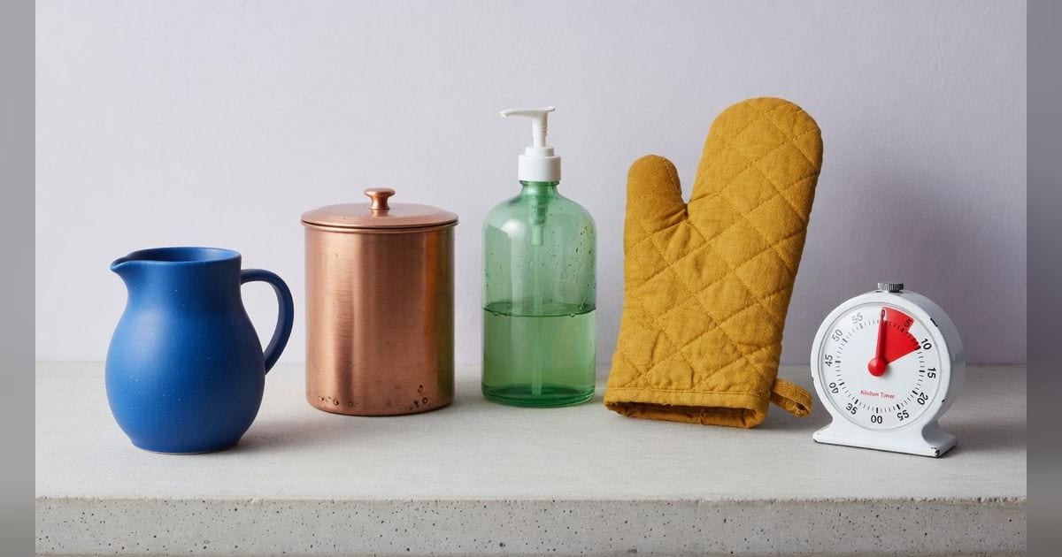
1. Color-bound pantry lineup
A precise studio still life of five household objects arranged in a gentle arc on a pale concrete shelf, front-facing and evenly spaced, 16:9: a matte cobalt-blue ceramic pitcher, a brushed copper canister, a translucent jade-green glass soap dispenser, a mustard-yellow linen oven mitt, and a glossy white enamel timer with a red needle. Each object must keep its own exact color and material with no swapping or bleeding; the ceramic should stay blue and matte, the canister distinctly copper and metallic, the soap dispenser green and transparent, the mitt yellow and fabric-textured, and the timer white enamel with only the needle red. Soft north-window daylight with subtle shadows, minimalist editorial product photography, clean background, crisp separation and accurate attribute binding.
Winner: GPT Image 2 API — Model B adheres more precisely to the prompt with cleaner attribute binding, a more even front-facing lineup on the pale concrete shelf, and a stronger minimalist editorial look. Model A is also good, but the timer shape and printed text feel less faithful and polished, and the arrangement is slightly less refined. (Second judge pass, order swapped — scores are the average of both: Model B matches the prompt more precisely: all five objects are front-facing, evenly spaced on a pale concrete shelf, with accurate color/material binding and a cleaner minimalist editorial look. Model A is attractive but deviates more in composition and attribute details, including a less front-facing timer, a whiter pump instead of a metallic-looking dispenser top, and extra red text/graphics on the timer face beyond only the red needle.)
2. Hands & anatomy
A natural candid photo of a person tying a friendship bracelet, both hands clearly visible with anatomically correct fingers and a plausible grip on the threads, soft daylight, shallow depth of field, 16:9.
Winner: Grok Imagine Image Quality — Model A better matches the prompt with both hands clearly visible, a convincing grip on the bracelet threads, and stronger emphasis on hand anatomy in a natural candid close-up. Model B is attractive and plausible, but the taped-down setup feels less candid and the hands are less prominently detailed for the anatomy-focused task. (Second judge pass, order swapped — scores are the average of both: Model B matches the candid daylight look and shallow depth of field well, but the left hand shows slightly awkward finger anatomy and the bracelet-tying action feels a bit less convincing. Model A has a more plausible grip and clearer hand anatomy while still fitting the prompt, though its framing is a bit tighter and more staged-looking.)
3. Negation
A cozy reading nook with an armchair, a stack of books, and a mug of tea by a window — with absolutely NO plants, NO lamps, and NO artwork or picture frames anywhere in the frame. Warm afternoon light, 16:9.
Winner: Grok Imagine Image Quality — Model A adheres more strictly to the negation constraints, showing a cozy armchair, books, and tea by a window without any visible plants, lamps, or artwork/picture frames. Model B is attractive and well-composed, but the large built-in bookshelf dominates the scene and weakens the simpler reading-nook feel requested, making Model A the better prompt match overall. (Second judge pass, order swapped — scores are the average of both: Model A adheres more tightly to the prompt by showing the required armchair, stack of books, mug of tea, and window while avoiding plants, lamps, and artwork; Model B is attractive but introduces a full bookshelf rather than just a stack of books and feels slightly less aligned. Model B has cleaner polish, but Model A’s composition and mood better match the intended cozy reading nook.)
4. Cider stand placard
A close, legible product-shot scene of a small countertop farmers-market display in warm morning light: two dusty pears, a brown paper bag, and a dark green glass bottle beside a cream card placard clipped into a brass stand. The placard must be easy to read and centered in the composition, with clean hand-painted serif lettering that says exactly: "MALLOW FIG CIDER" on the first line and "BOTTLE 7" on the second line. Include no other readable text. The style is rustic editorial still life with restrained autumn colors, shallow depth of field that keeps the entire placard sharp, gentle side lighting from the right, and a tidy uncluttered background.
Winner: GPT Image 2 API — Model B adheres more closely to the prompt with a centered, highly legible placard, cleaner rustic editorial styling, and the exact required text without extra readable markings. Model A is attractive and close in mood, but the placard is smaller and lower in the frame, includes an extra decorative mark, and the bag/bottle introduce additional readable-looking details that weaken adherence. (Second judge pass, order swapped — scores are the average of both: Model B adheres more closely to the prompt: the placard is centered, fully legible, uses the exact required text with no extra readable text, and the still life matches the requested rustic editorial setup. Model A is attractive, but the placard is smaller and less centered, includes an extra decorative mark, and the paper bag appears to contain additional readable text, reducing prompt compliance.)
5. Memphis breakfast cart
A playful still life of household breakfast items rendered faithfully in 1980s Memphis design style, 16:9: a wheeled bar cart holds a speckled teal toaster, a pink-and-black zigzag thermos, a bowl of lemons patterned with squiggles, and a stack of plates decorated with bold triangles and confetti dots; the floor is a graphic laminate of asymmetrical shapes, and the wall behind has pastel blocks, wavy lines, and high-contrast geometric decals. The image should strongly embody named Memphis style rather than generic retro: candy colors, provocative pattern clashes, postmodern geometry, crisp cutout silhouettes, and playful, intentionally artificial staging. Bright flash-lit interior with minimal soft shadow, slightly low camera angle, magazine-spread composition.
Winner: Tie — Model B adheres more faithfully to the prompt by clearly presenting a wheeled bar cart in a magazine-spread 16:9 composition with strong named Memphis cues across the cart, wall, and floor. Model A has vibrant Memphis styling and appealing objects, but the cart reads more like a low table and the staging is less aligned with the specified bar-cart still life. (Second judge pass, order swapped — scores are the average of both: Model A more strongly embodies named Memphis design through louder pattern clashes, candy colors, and intentionally artificial postmodern geometry while still clearly depicting the requested breakfast items on a wheeled cart. Model B is polished and well composed, but it feels slightly more like tasteful retro decor than the exaggerated 1980s Memphis magazine-spread look requested.)
6. Named art style
A ukiyo-e woodblock print of a fishing boat riding a large cresting wave at dawn, faithful to the flat color planes, bold outlines, and stylized foam of the tradition, muted indigo and cream palette.
Winner: GPT Image 2 API — Model B more faithfully captures the ukiyo-e woodblock tradition through flatter color planes, iconic stylized foam, period-appropriate composition, and the muted indigo/cream palette, while also presenting a stronger dawn setting. Model A is attractive and well-crafted, but it feels more like a modern illustration inspired by ukiyo-e than a fully faithful woodblock print. (Second judge pass, order swapped — scores are the average of both: Model B more faithfully matches the requested ukiyo-e woodblock print tradition, especially in its flat color planes, bold outlines, stylized foam, muted indigo-and-cream palette, and dawn atmosphere. Model A is attractive and well composed, but it feels more like a modern illustration inspired by ukiyo-e than a faithful traditional print, with smoother gradients and a less authentic overall treatment.)
7. Rainy conservatory teaware
A cinematic still life inside a narrow rooftop conservatory at dusk, 16:9: on a black stone table sits a smoked-glass teapot half full of amber tea, a ribbed crystal tumbler with a floating lime slice, a chrome moka pot, and a small oval vanity mirror leaning against a terracotta planter; beyond them, rain streaks the greenhouse panes and blurred city lights glow cyan and tangerine outside. The image must convincingly show reflection and transparency: the mirror should reflect the side of the teapot and part of the planter from the correct angle, the chrome moka pot should carry distorted highlights of the window grid, the tumbler should refract the lime slice and table edge, and the tea should tint the glass teapot realistically. Moody film-noir-inspired lighting adapted to color, with one warm practical lamp from the left and cool rainy skylight from above, shallow depth of field but all reflective surfaces readable.
Winner: Tie — Model B adheres more closely to the prompt with a narrower conservatory feel, stronger noir-like warm/cool lighting, and more convincing handling of transparency and reflections in the teapot, tumbler, mirror, and chrome moka pot. Model A is attractive and readable, but the mirror reflection is less clearly correct, the tumbler refraction is weaker, and the overall scene feels less cinematic and less faithful to the specified arrangement. (Second judge pass, order swapped — scores are the average of both: Model A adheres more closely to the prompt by clearly presenting a smoked-glass teapot, ribbed crystal tumbler, chrome moka pot, oval mirror against a terracotta planter, and more convincing reflective behavior in the mirror and moka pot. Model B is atmospheric and polished, but the mirror reflection is less correct, the tumbler reads less refractively, and the teapot appears clearer than smoked glass.)
8. Spatial layout
A clean isometric illustration of a bedroom: a bed against the LEFT wall, a round rug centered on the floor, a desk under the WINDOW on the back wall, and a floor lamp in the FRONT-RIGHT corner. Flat-vector style, consistent perspective.
Winner: GPT Image 2 API — Model B adheres more closely to the requested spatial layout: the bed is clearly against the left wall, the desk sits directly under the back-wall window, the rug is centered, and the floor lamp is placed in the front-right corner. Model A is attractive and clean, but the desk is offset rather than truly under the window and the lamp reads more as right-side than distinctly front-right. (Second judge pass, order swapped — scores are the average of both: Model B matches the requested spatial layout more precisely: the bed is clearly against the left wall, the desk sits under the back-wall window, the rug is centered, and the floor lamp is placed in the front-right corner. Model A is attractive and clean, but the rug is less centered and the lamp reads more along the right wall than distinctly in the front-right corner.)
See every prompt and the full side-by-side outputs in the interactive Head-to-Head.