We strive to keep posts updated, but code samples may sometimes be outdated. Humans, see the
[Bryntum documentation]; agents,[https://mcp.bryntum.com]for the latest info.
A form that’s hardcoded in HTML needs a code change every time a question changes. For forms that change often, like an event registration form where the ticket types and workshops differ per event, it helps to define the fields as data and generate the UI from it. Update the JSON in the backend, and the form updates. The form is dynamic. A dynamic form can also mean form inputs change based on user input.
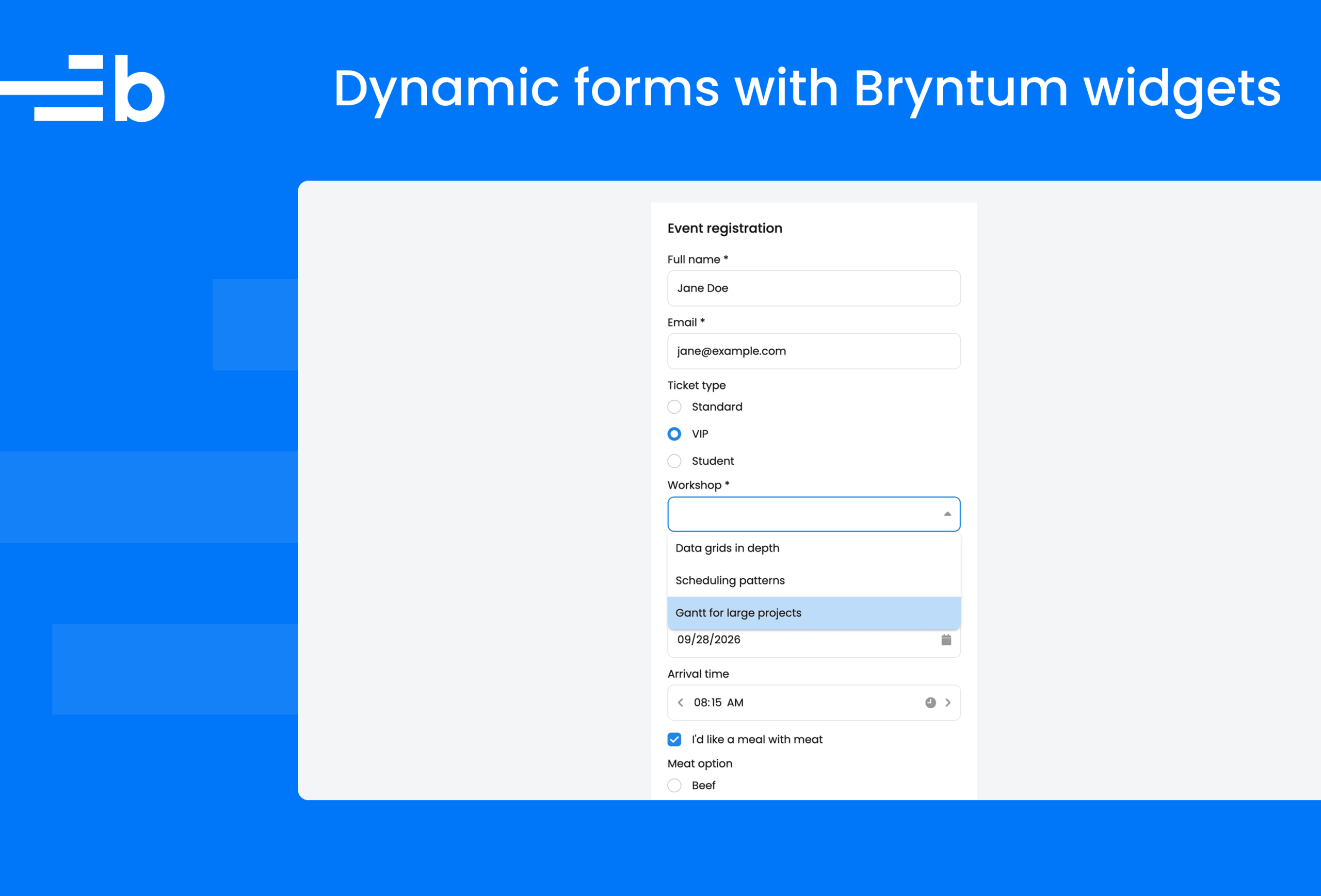
In this guide, we’ll show you how to build a dynamic event registration form in vanilla JavaScript using Bryntum widgets. The form is defined in a JSON file and validates user input. It also includes a dynamically displayed field that shows based on a user’s answer.
Bryntum is known for scheduling components such as the Gantt, Scheduler, and Scheduler Pro, but every Bryntum product ships with a set of core UI widgets: text fields, combos, date and time fields, checkboxes, radio groups, buttons, popups, and more. You can see them all in the kitchen sink demo.
Getting started: Setting up the project #
Create a vanilla JavaScript Vite project and install the Bryntum Grid trial, which includes all the widgets we need:
npm create vite@latest dynamic-forms -- --template vanilla
cd dynamic-forms
npm install
npm install @bryntum/grid@npm:@bryntum/grid-trial
If you have a Bryntum license, refer to our npm Repository Guide and install the licensed package.
Add a vite.config.js
file in the project root to prevent Vite from the Bryntum bundle twice in dev mode:
import { defineConfig } from 'vite';

export default defineConfig({
    optimizeDeps : {
        include : ['@bryntum/grid']
    }
});
Delete the Vite starter files src/counter.js
and the src/assets
folder:
rm src/counter.js && rm -r src/assets
Replace the <body>
of index.html
with a target element for the form and a <pre>
element for displaying the submitted values:
<body>
    <div id="app"></div>
    <pre id="output" hidden></pre>
    <script type="module" src="/src/main.js"></script>
</body>
Replace the contents of src/style.css
with the Bryntum CSS imports and some page styling:
@import "@bryntum/grid/fontawesome/css/fontawesome.css";
@import "@bryntum/grid/fontawesome/css/solid.css";
@import "@bryntum/grid/grid.css";
@import "@bryntum/grid/svalbard-light.css";
@import url("https://fonts.googleapis.com/css2?family=Poppins:wght@300;400;500;600&display=swap");

html,
body {
    height : 100%;
    margin : 0;
}

body {
    font-family : 'Poppins', 'Segoe UI', Arial, sans-serif;
    background  : #f4f5f7;
}

#app {
    display         : flex;
    justify-content : center;
    padding         : 2rem 1rem;
}

#output {
    max-width     : 480px;
    margin        : 1rem auto 2rem;
    padding       : 1rem;
    border        : 1px solid #d8dbe0;
    border-radius : 0.5rem;
    background    : #fff;
    overflow-x    : auto;
}
This imports the Bryntum Grid structural CSS, Font Awesome icons, and the Svalbard light theme. The Bryntum Grid has several themes with light and dark variants. You can customize these or create a theme from scratch.
The first four imports are required for Bryntum widgets: FontAwesome for icons, grid.css
for structural styles, and a theme (we use Svalbard light, the default).
Defining the form in JSON #
We’ll define the form as a JSON array, which makes it easy to update. Create a formSchema.json
file in the src
folder with the following contents:
[
    {
        "type"        : "textfield",
        "name"        : "name",
        "label"       : "Full name",
        "placeholder" : "Jane Doe",
        "required"    : true
    },
    {
        "type"        : "textfield",
        "name"        : "email",
        "label"       : "Email",
        "placeholder" : "jane@example.com",
        "required"    : true,
        "validate"    : "email"
    },
    {
        "type"    : "radiogroup",
        "name"    : "ticket",
        "label"   : "Ticket type",
        "value"   : "standard",
        "options" : {
            "standard" : "Standard",
            "vip"      : "VIP",
            "student"  : "Student"
        }
    },
    {
        "type"     : "combo",
        "name"     : "workshop",
        "label"    : "Workshop",
        "items"    : ["Data grids in depth", "Scheduling patterns", "Gantt for large projects"],
        "required" : true
    },
    {
        "type"     : "numberfield",
        "name"     : "quantity",
        "label"    : "Number of tickets",
        "value"    : 1,
        "min"      : 1,
        "max"      : 10,
        "required" : true
    },
    {
        "type"     : "datefield",
        "name"     : "eventDate",
        "label"    : "Attendance date",
        "required" : true,
        "validate" : "futureDate"
    },
    {
        "type"     : "timefield",
        "name"     : "arrivalTime",
        "label"    : "Arrival time",
        "value"    : "9:00 AM",
        "validate" : "businessHours"
    },
    {
        "type" : "checkbox",
        "name" : "meatMeal",
        "text" : "I'd like a meal with meat"
    },
    {
        "type"     : "radiogroup",
        "name"     : "meatChoice",
        "label"    : "Meat option",
        "value"    : "beef",
        "options"  : {
            "beef"    : "Beef",
            "chicken" : "Chicken"
        },
        "showWhen" : {
            "field"  : "meatMeal",
            "equals" : true
        }
    },
    {
        "type"        : "textareafield",
        "name"        : "dietary",
        "label"       : "Dietary requirements",
        "placeholder" : "Allergies, preferences..."
    },
    {
        "type" : "checkbox",
        "name" : "terms",
        "text" : "I accept the terms and conditions"
    }
]
Each array object is Bryntum widget config. The type
string names the widget class to create: textfield,
combo
numberfield
datefield
timefield
textareafield
checkbox
radiogroup
name
is the key each field’s value is stored under when we collect the results. Constraints like min
and max
on the number field are validated by the widget itself.There are three custom keys, handled by the mapping code in the next sections: required
marks a field the user must fill in, validate
names a custom validation function, and showWhen
makes a field conditional on another field’s value.
Writing the validators #
Replace the code in the src/main.js
file with the following imports and a registry of the custom validators the schema refers to by name:
import { Panel, Toast } from '@bryntum/grid';
import formSchema from './formSchema.json';
import './style.css';

const validators = {
    email({ value }) {
        const message = 'Enter a valid email address';

        if (value && !/^\S+@\S+\.\S+$/.test(value) && !this.containsFocus) {
            this.setError(message, true);
        }
        else {
            this.clearError(message, true);
        }
    },

    futureDate({ value }) {
        const
            message = 'Attendance date cannot be in the past',
            today   = new Date();

        today.setHours(0, 0, 0, 0);

        if (value && value < today && !this.containsFocus) {
            this.setError(message, true);
        }
        else {
            this.clearError(message, true);
        }
    },

    businessHours({ value }) {
        const
            message = 'Arrival time must be between 8:00 AM and 6:00 PM',
            minutes = value && value.getHours() * 60 + value.getMinutes();

        if (value && (minutes < 8 * 60 || minutes > 18 * 60) && !this.containsFocus) {
            this.setError(message, true);
        }
        else {
            this.clearError(message, true);
        }
    }
};
Each function follows the structure of the Bryntum checkValidity field config: Bryntum calls this function with the field as
this
whenever the field validates, and the function marks the field invalid with or removes the error with
setError
clearError
Validation also runs while the user is typing, so each validator only sets its error when the field no longer has focus (this.containsFocus
is false). A half-typed email address isn’t flagged mid-keystroke, and errors clear as soon as the user starts fixing the field.
Passing true
as the second argument of setError
and clearError
skips re-syncing the field’s valid state, which would call checkValidity
again.
Mapping schema entries to Bryntum widgets #
Next, add the function that turns a schema entry, from the JSON file, into a widget config:
function toWidgetConfig({ validate, showWhen, required, ...config }) {
    return {
        ...config,
        ref : config.name,
        cls : {
            'conditional-field' : Boolean(showWhen),
            'required-field'    : Boolean(required)
        },
        hidden        : Boolean(showWhen),
        checkValidity : validate && validators[validate]
    };
}
This function removes the three custom keys and passes everything else through. The validate
name is resolved to a function from the registry and becomes the field’s checkValidity
config. Fields with a showWhen
condition start hidden. Setting ref
to the field’s name
makes every field reachable through the form’s widgetMap, which we use for the conditional logic later.
The required
key is enforced in the submit handler rather than passed to the widget, because the built-in required
config flags empty fields as invalid before the user has touched the form. The required-field
CSS class will render the asterisk instead.
Add this style to src/style.css
:
.required-field label::after {
    content : " *";
}
Creating the form and handling submission #
Bryntum’s Container widgets build their children from an
array of typed config objects, so rendering the form is a single
items
map
call. We use a , a Container with a title bar and a bottom toolbar (
Panel
bbar
Add the following to src/main.js
:
// The schema's initial values, reused to reset the form after submitting
const initialValues = Object.fromEntries(
    formSchema.map(({ name, value }) => [name, value ?? null])
);

const output = document.querySelector('#output');

const form = new Panel({
    appendTo      : 'app',
    title         : 'Event registration',
    width         : 480,
    cls           : 'registration-form',
    labelPosition : 'above',
    defaults      : {
        // Don't flag fields as invalid while the user is still typing
        validateOnInput : false
    },
    items : formSchema.map(toWidgetConfig),
    bbar  : [
        '->',
        {
            type      : 'button',
            ref       : 'registerButton',
            text      : 'Register',
            rendition : 'filled',
            // Stays disabled until the terms checkbox is ticked (wired below)
            disabled  : true,
            onClick() {
                // Flag visible, empty required fields with a temporary
                // error that clears on the next interaction
                const missing = formSchema
                    .filter(field => field.required)
                    .map(field => form.widgetMap[field.name])
                    .filter(field => !field.hidden && (field.value == null || field.value === ''));

                missing.forEach(field => field.setError('This field is required', false, true));

                if (!missing.length && form.isValid) {
                    // Hidden conditional fields still contribute to values,
                    // so drop them from the submitted data
                    const values = form.values;

                    form.queryAll(widget => widget.hidden && widget.name)
                        .forEach(widget => delete values[widget.name]);

                    Toast.show({
                        html    : 'Registration submitted!',
                        timeout : 4000
                    });
                    output.textContent = JSON.stringify(values, null, 4);
                    output.hidden = false;

                    // Reset the form to the schema's initial values
                    form.values = initialValues;
                }
                else {
                    const errors = form.queryAll(widget => widget.isField && !widget.isValid)
                        .map(field => {
                            const messages = field.getErrors().join(', ');

                            return field.label ? `${field.label}: ${messages}` : messages;
                        });

                    Toast.show({
                        html    : `Please fix the following:<br>${errors.join('<br>')}`,
                        timeout : 4000
                    });
                }
            }
        }
    ]
});
The Panel does most of the form plumbing for us. The values property collects every field’s value into an object keyed by field
name
, and is only
isValid
true
when all contained fields are valid. Setting labelPosition
and defaults
on the Panel applies them to every generated field, and the '->'
item in the bbar
pushes the Register button to the end of the toolbar.The submit handler checks the required
fields. The third argument of setError
marks the error as temporary, meaning Bryntum removes it as soon as the user interacts with that field again, so the red outline around the invalid input disappears while the user fixes each field. If everything is valid, a Toast widget confirms the submission, the collected values render as JSON, and assigning
form.values = initialValues
resets the form to the state defined in the schema.Run npm run dev
and open the app in your browser to try it: submitting the empty form lists each problem in a toast and highlights the fields, and a successful submission prints the values below the form:
Showing fields conditionally #
A dynamic form can also react to input. In our schema, the meat option radio group only applies when the meal checkbox is ticked, which its showWhen
key describes:
"showWhen" : {
    "field"  : "meatMeal",
    "equals" : true
}
Add the logic for this conditional field at the bottom of the src/main.js
file:
formSchema.filter(field => field.showWhen).forEach(({ name, showWhen }) => {
    const
        target     = form.widgetMap[name],
        controller = form.widgetMap[showWhen.field];

    function sync() {
        if (controller.value === showWhen.equals) {
            target.show();
        }
        else {
            target.hide();
        }
    }

    controller.on('change', sync);
    sync();
});
This finds each conditional field and the field that controls it in the widgetMap
, then shows or hides the target whenever the controller’s value changes. Bryntum skips hidden fields during validation, so a hidden required field never blocks submission. The submit handler we wrote earlier removes hidden fields from the collected values for the same reason.
The show()
and hide()
methods toggle Bryntum’s b-hidden
CSS class, which we can animate with a few lines of CSS. Add these styles to src/style.css
:
/* Animate conditional fields in and out. `display` transitions
   discretely, keeping the field visible while it fades and slides;
   @starting-style provides the transition's entry values. */
.conditional-field {
    transition : opacity 0.3s ease, translate 0.3s ease, display 0.3s allow-discrete;
}

.conditional-field.b-hidden {
    opacity   : 0;
    translate : 0 -0.5em;
}

@starting-style {
    .conditional-field:not(.b-hidden) {
        opacity   : 0;
        translate : 0 -0.5em;
    }
}
The allow-discrete transition behavior keeps the field rendered until the fade-out finishes, and
supplies the starting values for the fade-in, so the field slides into place when it appears.
@starting-style
Preventing form submission if terms and conditions acceptance checkbox not checked #
Rather than let the user submit and then flag the unchecked terms box as an error, we keep the Register button disabled until the terms are accepted. The button starts disabled through its config (disabled : true
), and a ref
puts it in the widgetMap
so we can toggle it later.
Add the following code to the bottom of src/main.js
:
// Keep the Register button disabled until the user accepts the terms.
// This also re-disables it after a submit, since resetting the form
// unchecks the terms checkbox and fires a change event.
const
    termsField     = form.widgetMap.terms,
    registerButton = form.widgetMap.registerButton;

function syncRegisterButton() {
    registerButton.disabled = !termsField.value;
}

termsField.on('change', syncRegisterButton);
syncRegisterButton();
Like the conditional-field logic, this listens to the checkbox’s change
event and reads both widgets from the widgetMap
. Because assigning form.values = initialValues
unchecks the terms box after a successful submission, the same change
handler re-disables the button automatically, with no extra reset code.
Building this demo with the Bryntum MCP server and skills #
We built this demo with the help of Bryntum’s AI tooling. The Bryntum MCP server gives coding agents like Claude Code version-specific Bryntum documentation, which is how we verified widget type strings, the checkValidity
contract, and the values
behavior without leaving the editor. Add it to any MCP-capable agent from https://mcp.bryntum.com
.
The Bryntum skills complement the MCP server with product-specific instructions that steer an agent toward current APIs and away from deprecated patterns, like v6-era theme imports or button styling.
Extending the form #
The whole form is now three files: a JSON schema, a mapping layer of about 60 lines, and some CSS. Adding a field to the event registration form means adding an object to formSchema.json
. New validation rules are new entries in the validators
registry, and any field becomes conditional by giving it a showWhen
key.
See the Pen Bryntum widgets: dynamic form by Bryntum (@bryntum-snippets) on CodePen.
The same approach extends to whatever your forms need next: more widget types from the kitchen sink demo, cross-field validation in a validator that reads other fields through widgetMap
, or a schema fetched from your backend instead of a static file.
Build it with Bryntum Grid #
Start a free trial, explore live demos, or read the docs.