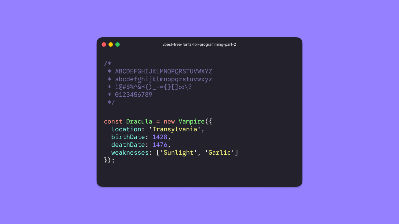
Five years ago we put together 14 Best Free Fonts for Programming. Here are 14 more free variable monospace fonts for programming — ready for your editors, IDEs, terminals, and others.
§1. Google Sans Code Google built this one for its own products — Gemini, Android Studio, and beyond. The letterforms stay crisp at small sizes, with open counters and clear distinction between characters that usually get confused. It is one of the few coding fonts with a dedicated monospace axis on top of weight, so you can fine-tune how "code-like" it feels.
§2. Datatype The newest font here, and one of the most interesting. Datatype lets you adjust both weight and width — rare for a monospace font. Frank Tisellano designed it with data-heavy interfaces in mind, but it works just as well in a terminal if you want something that does not look like every other coding font.
[§](#3-lilex)3. Lilex

If you like IBM Plex Mono but wish it had ligatures, this is the one. Lilex builds on Plex's clarity and adds programming ligatures, Powerline symbols, and Greek support. It landed on Google Fonts recently, and the weight range covers everything from light comments to heavy keywords.

[§](#4-intel-one-mono)4. Intel One Mono
Intel open-sourced this family with accessibility as the main goal — reducing eye strain and helping developers with low vision read code for longer stretches. Frere-Jones Type drew the letterforms, and the result is clean and understated. It will not steal the show, but your eyes will thank you after an eight-hour session.
§5. Geist Mono Vercel's type system made the jump from product UI to code editor. Geist Mono is neutral, well-proportioned, and pairs naturally with Geist Sans if you want the same typeface in your app and your terminal.
§6. Ubuntu Sans Mono Ubuntu Mono has been a Linux staple for years. This is its successor — same humanist spirit, updated to match the newer Ubuntu Sans branding. Dalton Maag kept the reliable feel that terminal users already know.
§7. Reddit Mono Reddit's open-source type system includes a monospace variant, and it is better than you might expect from a corporate font. Slightly rounded, friendly without being silly, and comfortable at 13px.
§8. Kode Mono This one leans into nostalgia — Isa Ozler drew inspiration from early computer displays and pixel-era typography. The surprise is how well it renders at modern sizes. A fun choice if you want your editor to feel a bit retro without sacrificing readability.
§9. Roboto Mono Roboto Mono has been the default monospace on countless Android devices for years. The variable update makes it more flexible than ever. Neutral, familiar, and hard to argue with — sometimes boring is exactly what you need.
§10. Martian Mono Evil Martians' first open-source typeface — a monospaced companion to Martian Grotesk with a tall x-height and a brutalist edge. The standout feature is the dual axes: squeeze or stretch the width and dial the weight. Great if you like tweaking typography as much as you like tweaking config files.
§11. Chivo Mono The monospace extension of the popular Chivo family. It inherits the sturdy grotesque skeleton of its sans-serif sibling and adds uniform widths for code. Popular for a reason — it just works everywhere.
§12. Spline Sans Mono The monospace counterpart to Spline Sans — rounded terminals, open apertures, and a warmer tone than most coding fonts. Softer personality, same clarity.
§13. Azeret Mono
Designed by Displaay, Azeret Mono packs a wide weight range into a compact frame. Characters like 0
and O
are easy to tell apart, and the narrow default width means more columns on screen.
§14. Red Hat Mono The monospace member of Red Hat's corporate type system. Geometric, confident, and carefully spaced — it shares DNA with Red Hat Text and Display. Dependable in both light and dark themes.
§What's your favorite one? Pick one, live with it for a few days, and see if it sticks. If your daily driver is not here — or in part 1 — let us know on Discord. Pair it with Dracula Pro for refined colors, crafted for focus, and more, all in one package.