Benedict Evans with a succinct review on Threads:
Wow, what a total mess.
What is the difference between a project, a task and a chat?
Why did chats get a crappy floating window but tasks and projects don’t?
Why does choosing ‘plugins’ get me ‘templates’?
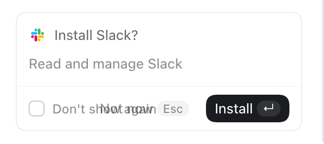
Am I not allowed to finish ‘setup’ if I don’t use Slack or Google Drive?
I forget how I made the Setup dickbar disappear despite my not using Slack or Google Drive. It was confusing.
It is sometimes observed that in companies dominated by internal politics, their shipped product (and public keynotes) reflect the company’s org chart. That’s never been truer than with the new ChatGPT app. OpenAI’s internal org chart is a complete disorganized mess. This new app perfectly reflect that.
The old ChatGPT app was focused. That’s the app that still ships for mobile (which includes iPad, which tells you whether OpenAI thinks iPad is a real computer or a big iPhone), and is, for some Mac users, left installed on their systems as “ChatGPT Classic”. The new app is an incredibly confusing sloppy mess. At a glance it looks like a polished app. But the UI is just slop. It has the veneer of a polished app without actually being organized or structured or labeled in ways that add clarity and coherence. It’s playing dress-up as a big-boy app. My understanding from people adjacent to OpenAI is that the company’s senior executives are singularly consumed with FOMO obsession regarding Anthropic, and the only A-team within the company are the AI researchers. Not product designers or app craftspeople.
The app icon for the new “super” app should be the Homer.