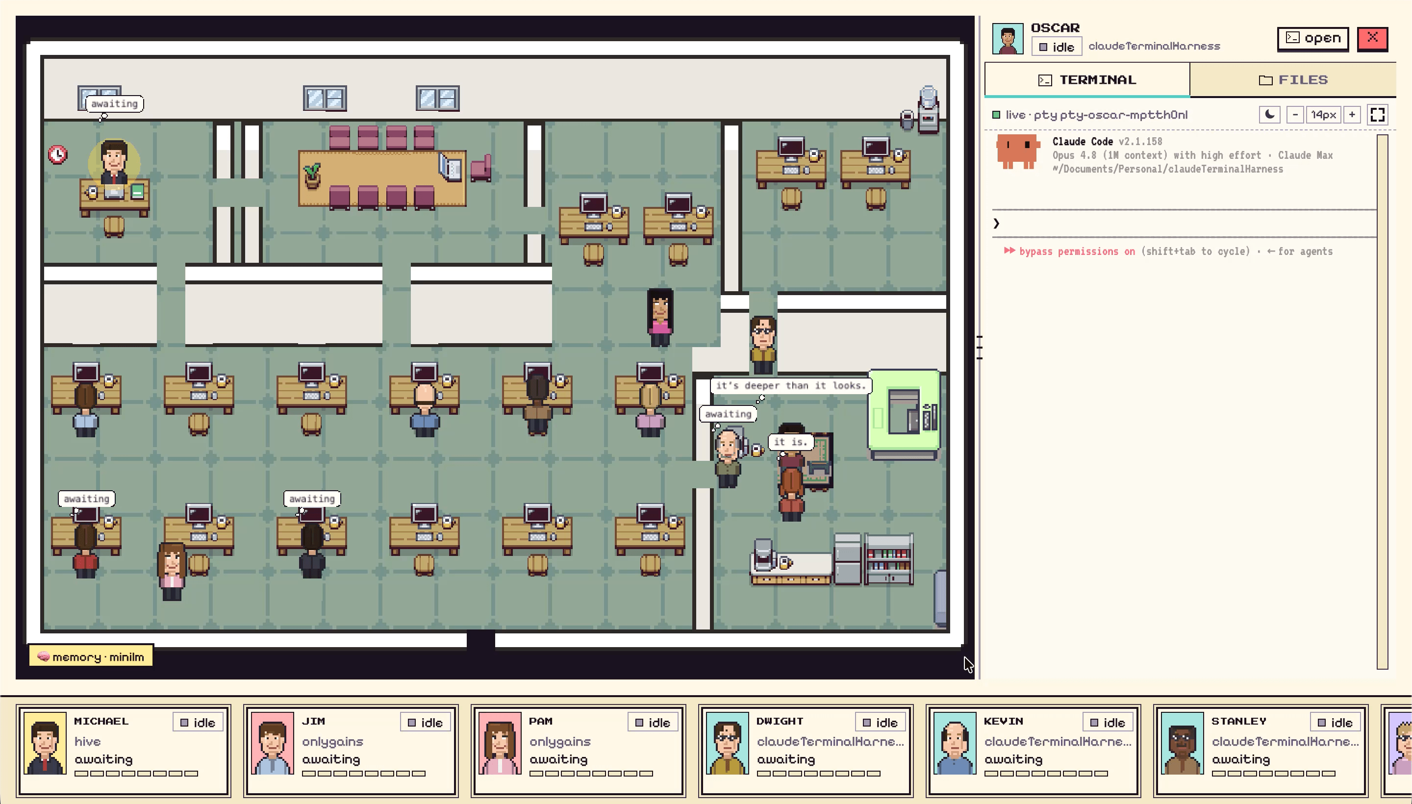
Reddit said our blog was unreadable and AI-sloppy. So one agent redesigned it end to end: a new editorial theme, and 119 hand-drawn hero illustrations rendered as code for exactly $0 in image APIs. This is the making-of.
The redesign you're looking at — the fonts, the yellow, the little hand-drawn scenes on every post — was shipped end to end by one agent after Reddit told us the old blog read like AI slop. The part worth stealing: all 119 hero illustrations are drawn as code — an SVG parts library, 16 composition archetypes, one spec file — and rendered by screenshotting a browser.
Image-API bill: $0.

During [launch week](https://munderdiffl.in/blog/what-reddit-told-us-about-munder-difflin/), among the feedback about
the product, there was a quieter thread of feedback about this blog. It was not kind. The old design was the marketing site’s mono-font brutalism stretched over long-form text, there wasn’t a single image on any post, and more than one person used the phrase “AI-written.”
Fair. So we handed the problem to an agent, with a brief instead of a mockup: make it readable, make it human, give every post images, and don’t you dare use red.
Two themes, one survivor # #
The agent’s first deliverable was two complete, buildable themes — not moodboards, actual switchable CSS behind an environment flag, previewable side by side. One warm and bookish, one editorial-magazine. The magazine won: serif headlines with real weight, a reading column set in a proper text face, the app’s own cream-paper palette, and the website’s yellow as the single accent — always as a highlighter fill, never as colored text.
The founder’s role in this phase was one sentence at a time: use the app’s colors. The accent is yellow, not red. No red anywhere. Each note came back applied across every template within minutes. That loop — human taste, agent hands — is the whole
[reason this product exists](https://munderdiffl.in/blog/why-we-built-munder-difflin/).

## The image problem, and the $0 answer [#](#the-image-problem-and-the-0-answer)
Then the hard part: 119 posts needed images, and AI image generation was the obvious move — and the wrong one. Quotes came out between $5 and $20 in API costs, every regeneration would cost again, and the results would have exactly the generic sheen the redesign was trying to escape.
The agent proposed something better: draw them as code.
The system has three layers, all plain JavaScript and SVG:
A parts library— one small character (an adaptation of the MIT-licensedXiaohei, recolored to our brand yellow), desks, terminals, envelopes, a kanban wall, clocks, shields, coffee. A hand-drawn wobble comes from an SVG turbulence filter, seeded per post so no two images wobble identically.16 composition archetypes— “agents talking,” “night shift,” “versus,” “the routing desk” — each a function that arranges parts into a scene.** One spec file**— a line per post choosing an archetype and the handwritten annotations: the blue mechanism labels and the orange punchline you see in the corners.
A headless browser opens each scene at 1600×900 and screenshots it into the post’s media folder. All 119 rendered in three batches. Total image-API spend: zero. And when one scene looked wrong — a sleeping character whose eyes were open, which is nightmare material — the fix was editing a function, not re-prompting a diffusion model and praying.
One manifest to rule the media # #
Under the hood, a single media.json
drives every image, inline figure, and video embed on the
blog — per-post entries with a file path, alt text, and a status flag. Templates render a
designed placeholder until an entry flips to ready
, so the site never shows a broken image, and adding this very image pipeline to a new post is one JSON entry. YouTube embeds got the same treatment: click-to-load, privacy-friendly, with a placeholder state for videos that don’t exist yet.
The making-of, honestly # #
The parts nobody puts in the case study: the agent got the category badge black-on-black on the first pass and fixed it when told. It got told “I do not want any red things” after it had already picked a coral topic color, and remapped the entire palette. The founder’s browser cached the old build twice, producing two rounds of “you haven’t changed anything” that were resolved by an agent-written no-cache dev server. Real work looks like this.
But the scoreboard at the end: a full editorial redesign, 119 bespoke illustrations, a media pipeline, and CI deployment to production — one agent, one extended session, zero image-API dollars. The blog you’re reading is the artifact. If it still reads like AI slop, at least now it’s hand-drawn AI slop.
FAQ #
Who designed the new Munder Difflin blog?
A single agent, working in Claude Code, over one long session with founder feedback in the loop. It proposed two complete themes, and after one was chosen, it restyled the whole site, drew a hero illustration for all 119 posts, and shipped the result through CI to production.
How were 119 hero images made for $0?
They're not AI-generated bitmaps — they're drawn as code. A small SVG parts library (a character, desks, terminals, envelopes, a kanban wall) plus 16 composition archetypes and a per-post spec file produce each scene; a headless browser screenshots them at 1600×900. Editing an image means editing a line of JavaScript, and regenerating costs nothing.
What's the character in the illustrations?
An adaptation of Xiaohei, an open-source (MIT) illustration character we found through a starred repo — recolored to our brand yellow and put to work at tiny desks and terminals across every post. Credit to the original ian-xiaohei-illustrations project.